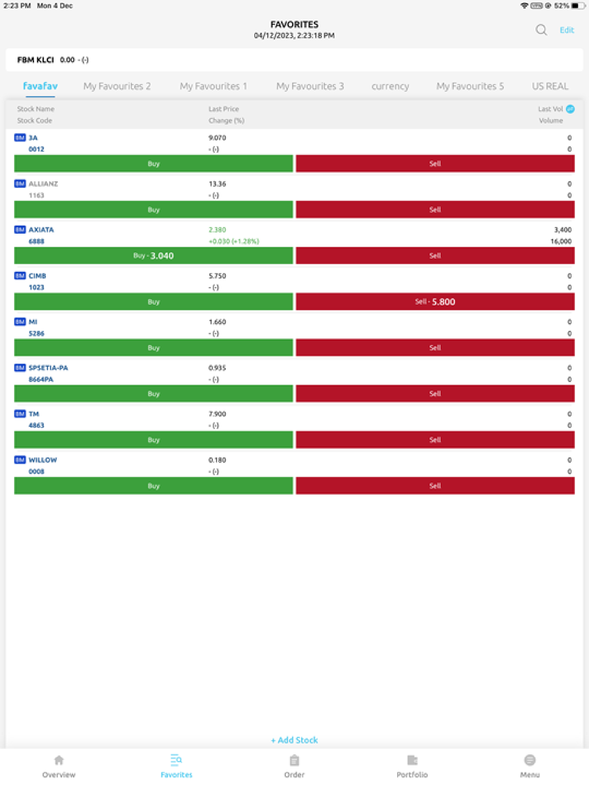
Terrible UI and UX design, so much wasted space taken up while stock counter display is so small
Oh come on, please hire proper UI and UX designer. 1. After the disaster that is the previous app, now we have an upgraded new app but still so not user-friendly. Do you guys even use your own app? 2. So much wasted space at the top part and bottom that can be optimised further with the spacing and lining. 3. Look at the stock counter display part. It’s so small. That’s the main page that used will interact the most with and yet it’s so small. 4. Look at other apps like M+ Global, Moomoo and WeBull. You guys don’t even know what’s important for your users and what’s not. 5. You guys are driving me up the wall. I really should closed down my account after the disaster that was the previous awful decision to switch to that incompetent vendor.


