Too many adverts
Too many adverts especially when looking at videos. I also find the subject of the videos inappropriate on my occasion. Example advertising for food when writing a news article about people starving. I am switching to BBC News


Ja, Sky News ist komplett kostenlos und enthält keine In-App-Käufe oder Abonnements.
⚠️ Die Sky News-App hat schlechte Bewertungen und negatives Feedback. Die Nutzer scheinen mit der Leistung oder den Funktionen unzufrieden zu sein.
Sky News ist kostenlos.
Um geschätzte Einnahmen der Sky News-App und weitere AppStore-Einblicke zu erhalten, können Sie sich bei der AppTail Mobile Analytics Platform anmelden.

4.57 von 5
347 Bewertungen in Singapur
Too many adverts especially when looking at videos. I also find the subject of the videos inappropriate on my occasion. Example advertising for food when writing a news article about people starving. I am switching to BBC News
No option to choose what news topics I’m interested in. The result is just a list of garbage headlines from around the world.
Sometimes too sensational and poorly informed journalists (especially Kay B); lacks proper fact-checking at times. Also, ticker exhibits poor grammar such as ignorance of the collective noun ‘police’. Additionally, frequent wrong distinctions between ‘wounded’ and ‘injured’; ‘killed’ and ‘died’. Finally, poor diction on the part of one particular political journalist (Beth R) Otherwise, reasonably comfortable with breadth of coverage and timely alerts.
watch live tv, tapped many times but unable to refresh
Only get this app on an iPad if you want to be driven mad by the page continuously jumping around as it starts adding content then instantly moving the page back. Better to use a browser.
News up to date n I enjoy reading them
This is Favourite news app
Loved Sky news until recently when the viewing format was changed. And now it’s the same adverts which are on for too long. I’m now using the BBC news which has a similar viewing format and no adverts. All the same news with TV no ads
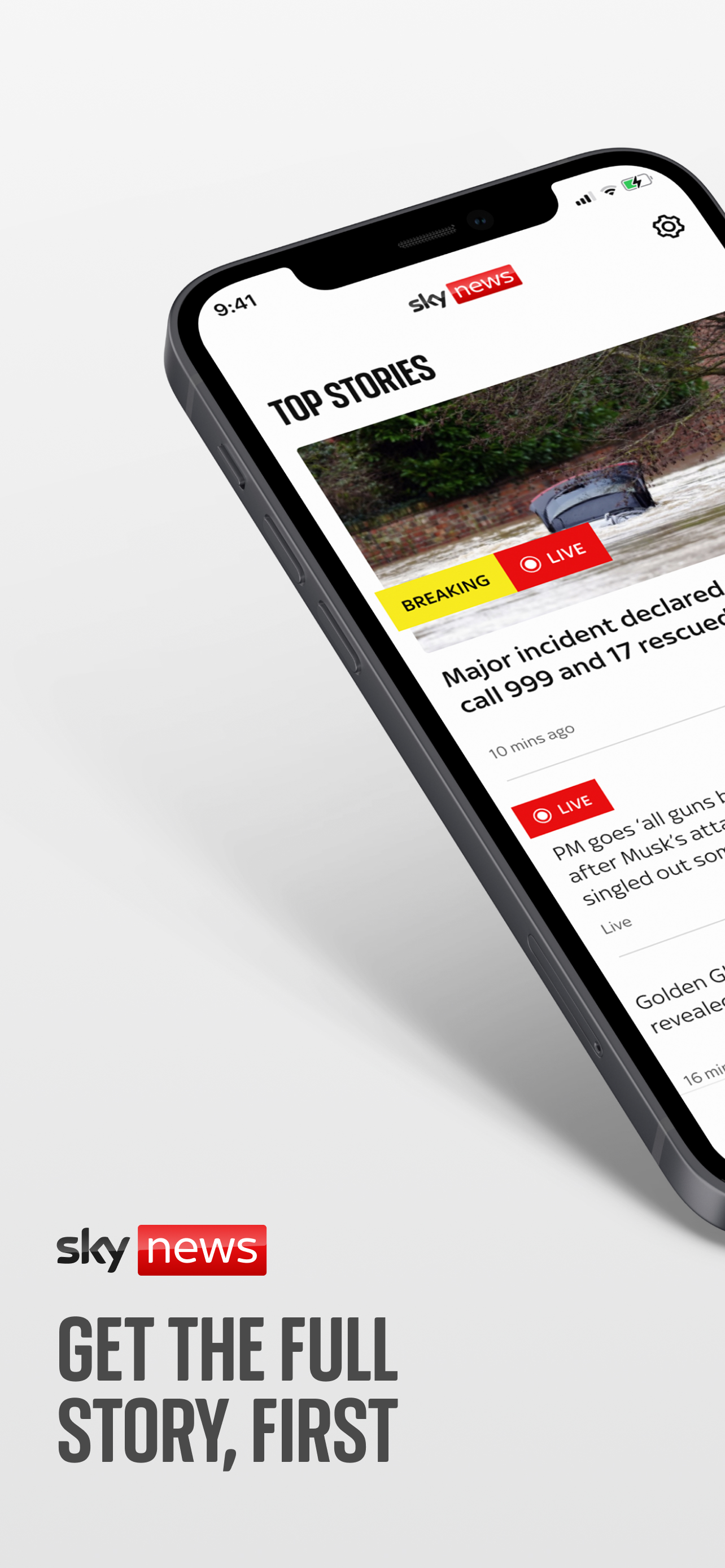
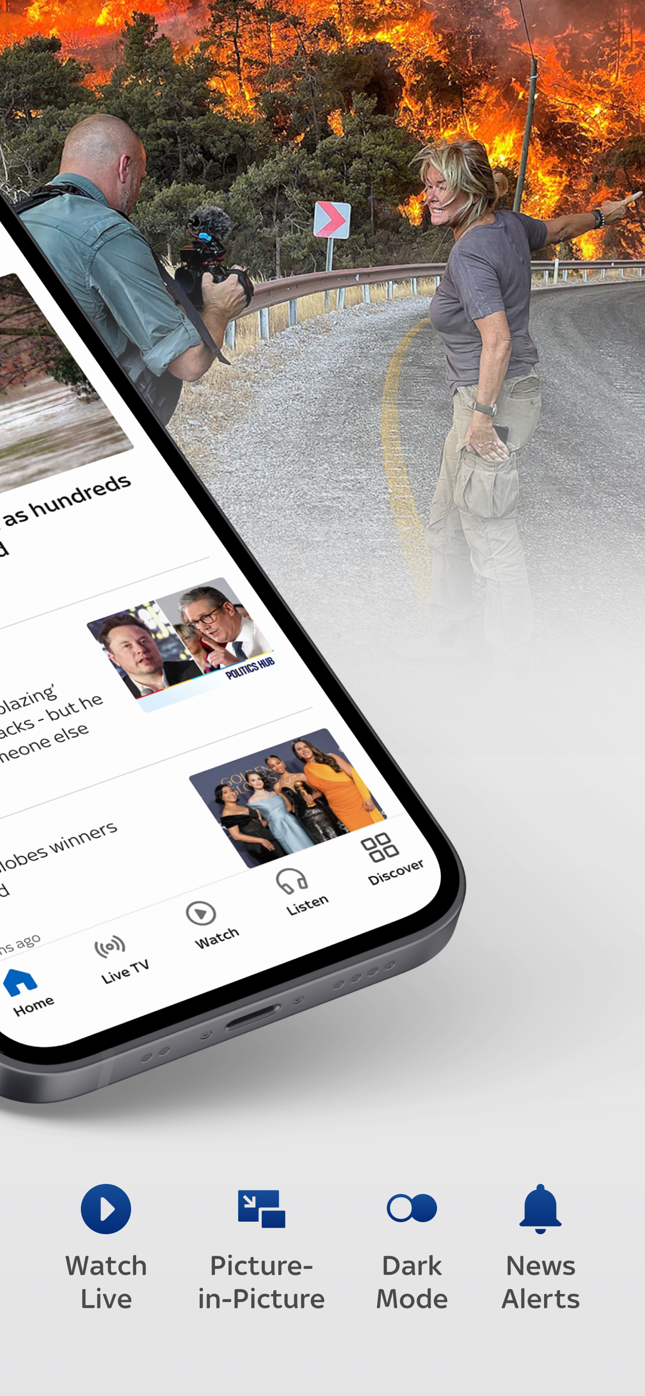
I have been” forced” to install the latest update on the Sky News App to access the news. The new format is awful. I don’t find the old “ new” format particularly good compared to the previous labour, with the Discover option at the bottom. ( I note the topic of Royals has disappeared. ) Instead of seamlessly flipping along the top to access the subjects,,now I have to go to the options and tap each individual subject , go into the topic and so on. The latest format is so distracting, with all the adverts all over the front page. The topics are in no particular nor sensible order. and I find it quite off putting. Not a good look either. Big boxes, spaces big, adverts big. Not a good idea Sky News. I will stick to the BBC news. As an update to my recent review above, I have tried to get used to the new format but not finding it too easy to navigate. Could we have all the top stories together please instead of splitting them up between random puzzles and other topics? Makes for a very fragmented format. However, is anyone reading these reviews please?as a further update please could I ask if there is any way to revert back to your previous format please? I’m afraid so can’t make head Nor sense of your new app, things are so disjointed and the worse this is that the news always used To be updated On an afternoon and Now it doesn’t and continues to shows old News for days On end On its main home page. pretty dire and awful I’m So disappointed as it used to be my favourite app. I don’t think anyone reads these reviews.
Still no improvement despite all of the negative feedback about how to access different topics Update - the latest version says that it groups topics together to make it easier to find things….. it doesn’t and it isn’t. It’s still an endless list of items with the topics hidden behind a menu pick at the bottom. I wonder of the person describing the update had actually used the App. Latest update has an updated look and feel bit they didn’t take the opportunity to revert to the easier to navigate tabs which is a missed opportunity. The UX gurus at sky have decided that hiding the different news topic areas behind a pop up list, and so needing two clicks, rather than having them directly accessible from her menu bar, only needing one click, is better - I wonder what training course they go on
|
Diagramm
|
Kategorie
|
Rang
|
|---|---|---|
|
Top Kostenlos
|

|
9
|
|
Top Kostenlos
|

|
14
|
|
Top Kostenlos
|

|
21
|
|
Top Kostenlos
|

|
33
|
|
Top Kostenlos
|

|
42
|
