Please add bold grid lines option
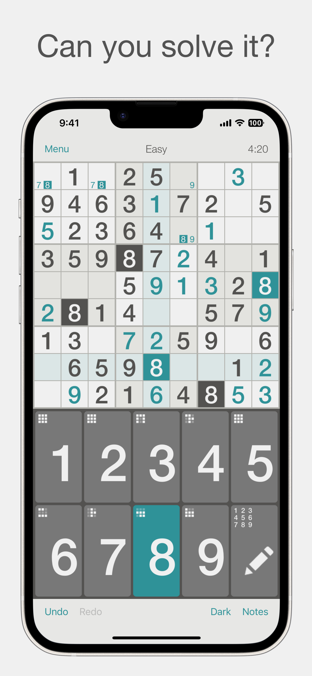
Overall, this Sudoku app is well-designed. However, one drawback is that the grid lines separating the 9x9 sections are too thin and faint. It would improve the user experience if there were an option to make these lines bolder or darker (for all themes), enhancing their visibility. This adjustment would help players better distinguish between the different sections of the puzzle. Thank you! Edit 07/10/2024: I emailed but did not get a response, the option to bold the grid lines should be really easy to add.


