Functional, but not fun.
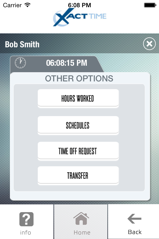
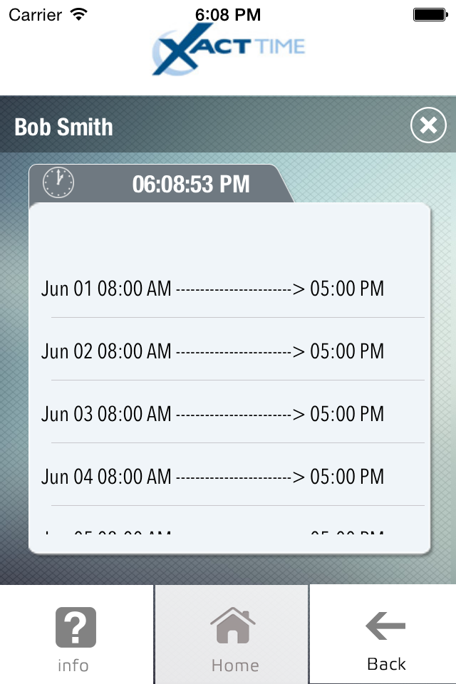
The UI for this app is way overdue for an upgrade. It’s just not intuitive. I appreciate certain functionalities, such as being able to make PTO requests within the app, and the ability to view recent hours worked. However, I only stumbled upon how to access these features by pure luck, even after consulting the user guide provided by my PEO. Multiple buttons for different types of punches (rather than one button that automatically moves through the different punches in a shift like the online portal does) add to the confusion. More design pet peeves: when you hit the “back” button with its arrow pointing left, the screen animation swipes to the right. I know it’s small, but, c’mon. Also, I don’t understand why clicking a button labeled “home” should prompt the user to log out. TL;DR — does the app serve its purpose? Sure. But it could be much more user-friendly. Clocking in and out shouldn’t be a chore.


