Looks nice but feels off
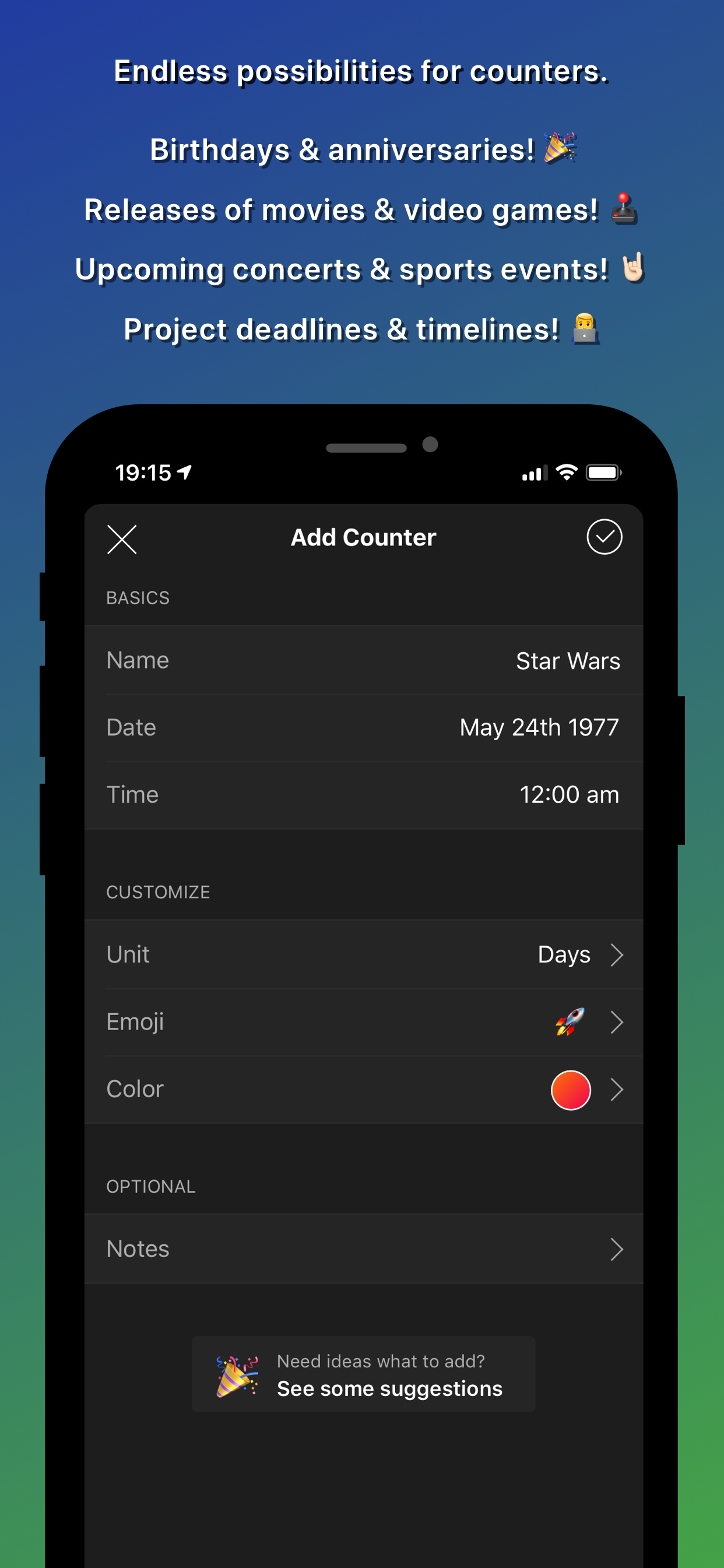
I thought I would like this app from the screenshots, but in use it feels and looks like a web app—corners aren’t rounded correctly, scrolling doesn’t rubber-band anywhere, and the various bars and controls and animations don’t match any of the system standard ones. I’m not sure what technology this was built with but I wish it were something that felt more like the rest of the OS.


