Horrible UX, no support, but it worked
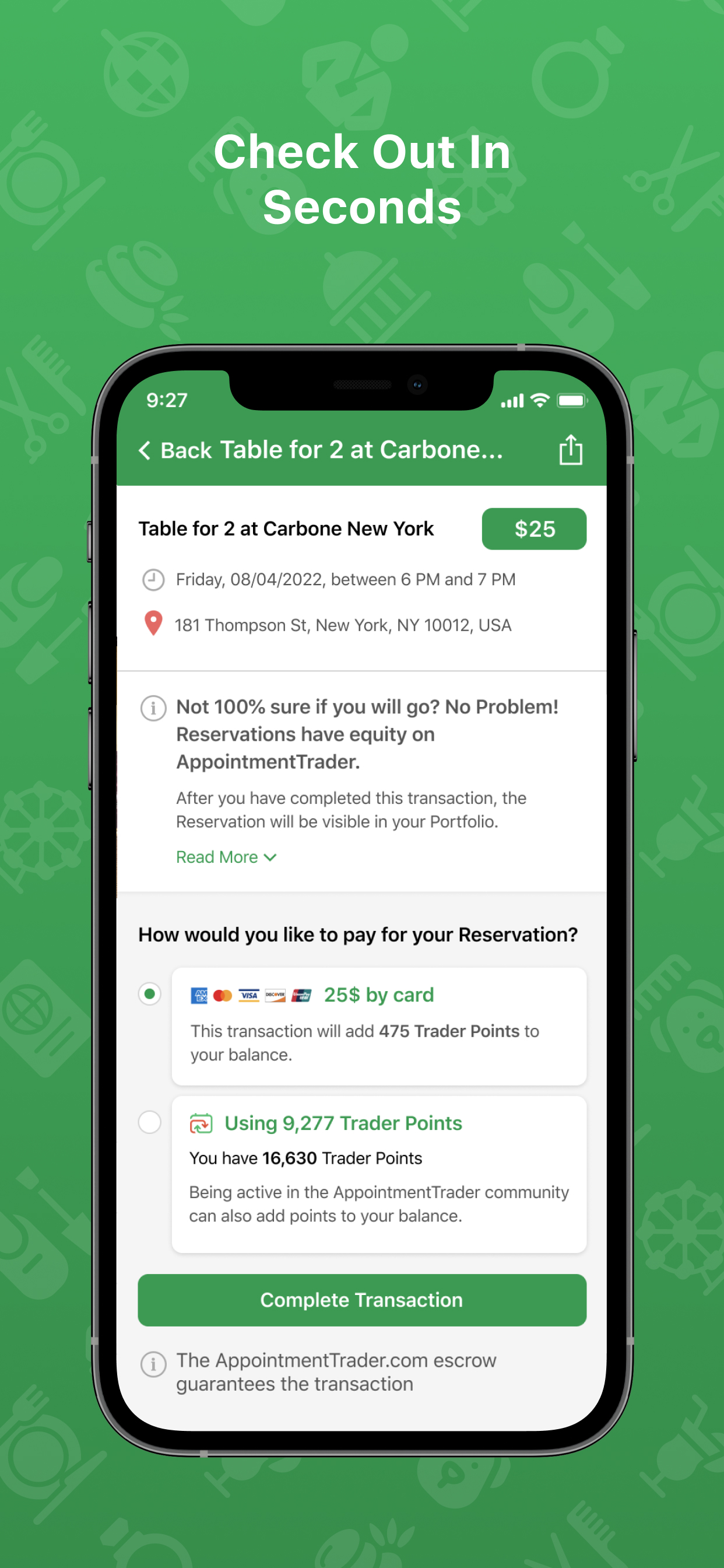
This website and app feel like they were created in the 90s. The UX is just so so bad. Most of the links seem to just redirect to the main listing page, and even without that the site is just opaque and badly designed. This coming from an internet native who can usually make sense of any site in a short time. I found using this site very frustrating. Everything on the site is market place based, so there’s no real guarantee that you’ll get something useful for your money. You can’t really take any actions, just put bids out for other people to maybe take actions or maybe nothing happens. This applies to the “customer support” as well, which seemed to be a black hole. That said, it did work in the end for what I wanted. I ended up canceling my bid for a reservation and when I got a notification for an instant buy option. I ended up having to personally text message the person listed on the resy reservation and ask them to contact the restaurant to transfer it to my name. Otherwise what’s to stop the person from just showing up? So I’m giving this a 2 because it worked, but I would not recommend it to anyone unless they were truly desperate.


