Clumsy app features - now worse.
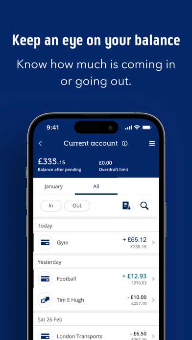
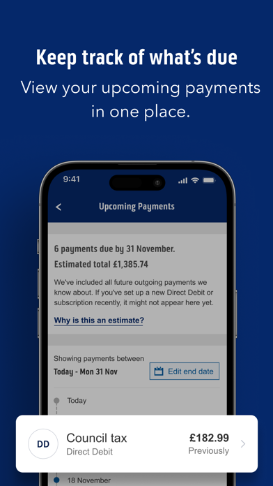
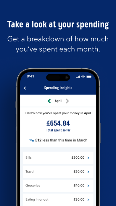
Some clunky illogical things ruin an otherwise good app. Have given feedback several times to BoS with no reply or fixes. 1. Recent: The colours were different for debits (black) and credits(blue). Was so easy to scroll through and see when payments or refunds have come in. Now all the amounts are all blue. Except for pending transactions. WHY HAS THIS CHANGED???. There are no credit/debit columns when viewing on a phone so the different colours were effective. NOW ITS SO HARD TO FIND CREDITS LISTED. Hard to read. TERRIBLE for people especially with poorer eyesight. Dreadful. I hate it. Have to squint and scroll up and down repeatedly to find refunds etc. PLEASE FIX IT BACK TO HOW IT WAS. 1. The upcoming payments list is stupid and NOT user friendly at all. First glance gives a timeline in sequence (helpful) but ONLY of standing orders, no direct debits, subscriptions etc. So then, when you click “view all upcoming payments” to see all of them, the time sequence IS JUMBLED for standing orders, with dates higgledy-piggledy. So not easy to read in order to estimate cash flow at a glance. Also, the DDs and subscriptions occur seperately below this - AND THEY ARE USUALLY NOT CURRENT, it frequently shows payments still to go out that have already gone out ( even past the payment date at time of viweing) making me rush to check the payment did in fact go out. OVERALL IT IS IMPOSSIBLE TO EVER VIEW A LOGICAL, SEQUENTIAL LIST OF WHEN FUTURE PAYMENTS DUE TO GO OUT. So PRETTY USELESS!! Have begged them to fix it. All other banks seem to manage to get this right. It’s not rocket science. Have used many banking apps and BoS’s app is pretty much the worst. Needs major redesigns in several areas not just those mentioned. Sometimes think to change banks as I do so much banking on my phone and hate it.


