


BankInter App needs to be fixed
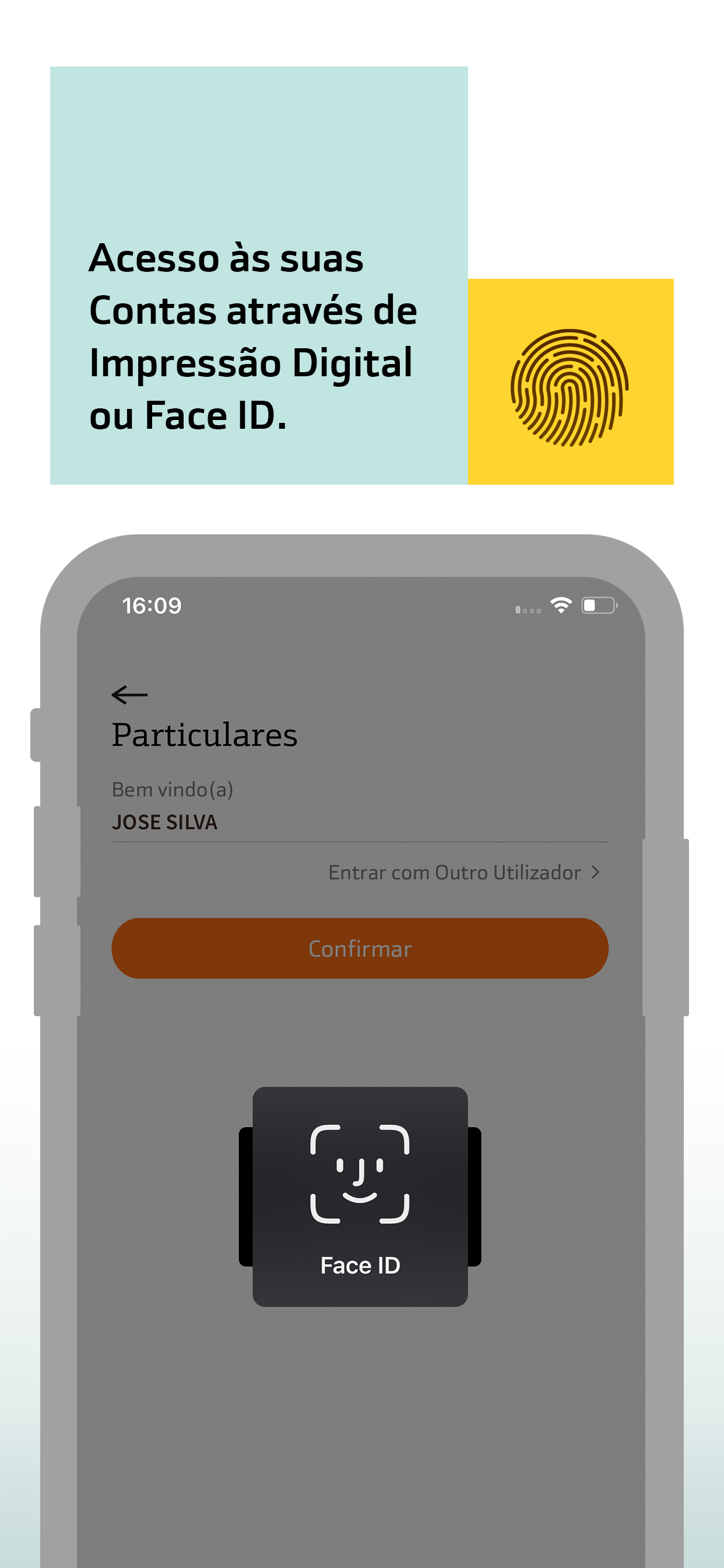
I have over 20 years experience in FinTech and mobile banking, so here are my recommendations to BankInter how to fix problems with their app: 1) You need to show full transaction description in the app. In the app, the description starts with a transaction type and a company number (e.g. Direct Deb. Collection - 0123456789). There is no or very little space left for a company name. So, customers have either to guess what company it is, or try to find the company number in invoices or other documents. This is very client unfriendly. 2) Please, remove the expiration period for the Touch ID. This expiration period does not solve any security problems, as finger prints don’t change once a year. Being forced to reactivate Touch ID regularly by filling in a password code and an ID document number is very annoying and doesn’t serve any purpose. Leading European banks don't require Touch ID reactivation (even after updating an app). 3) Please, combine two tabs - Transfer and Pay - into one. Both tabs allow customers to transfer money, the difference between Transfer and Pay is unclear and confusing for the app user. And please, hire experts in UX/UI to improve usability of your app + create the same interface for the mobile app and the online banking part of your website (Banco.bankinter.pt). Check for instance how the Dutch Rabobank did it.
