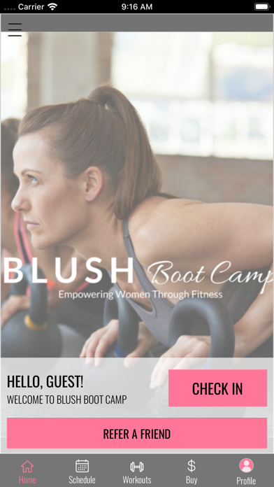
Can’t read the cover page
The opening page on this app is horrible it’s impossible to read even if you don’t need readers. The pink part is way to small and it looks like there is a film over it. The rest is great if they could add the name of the workout to the class your scheduling it would be perfect then you could get around not being able to read the cover page.


