Couple of UX Suggestions
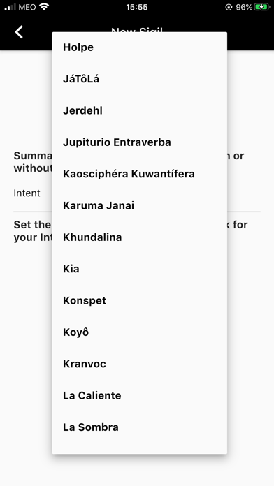
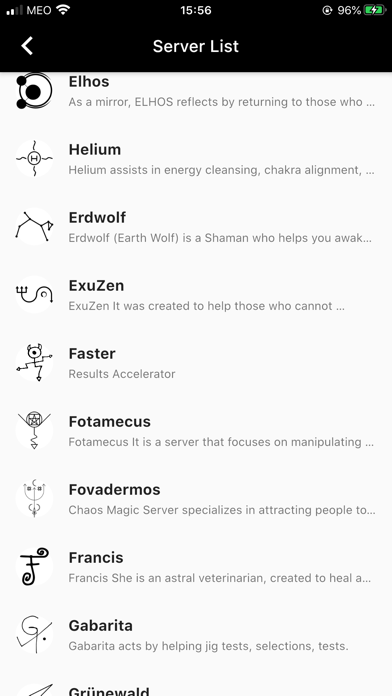
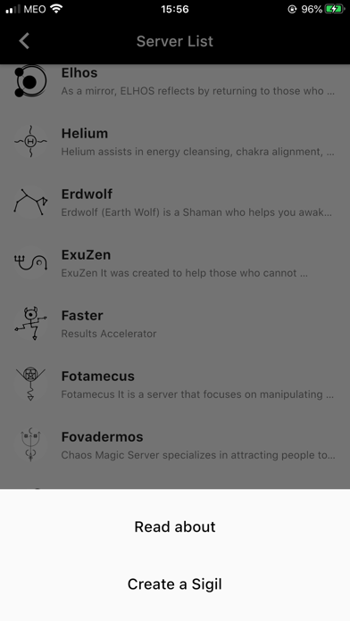
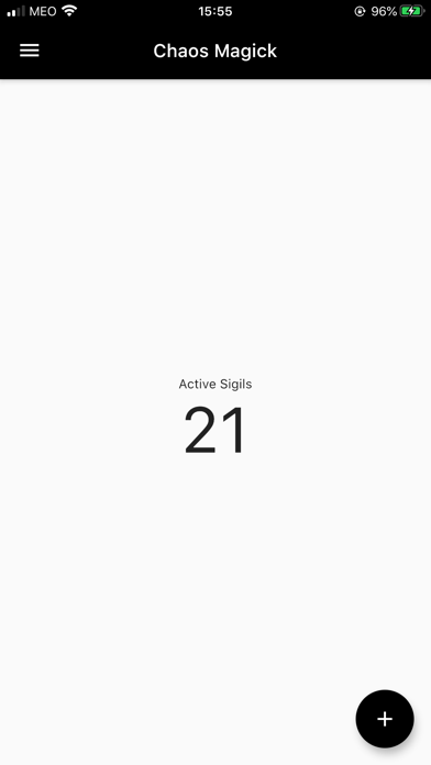
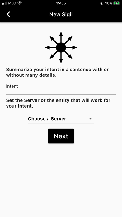
An important app to have in life. My two suggestions: Allow a full description of each server instead of a preview. Too many clicks to click through when choosing a 100 options. There could be a faster way to reference the appropriate server in need. Instead of having to click each one to reveal its powers.

