Color Scheme is Terrible
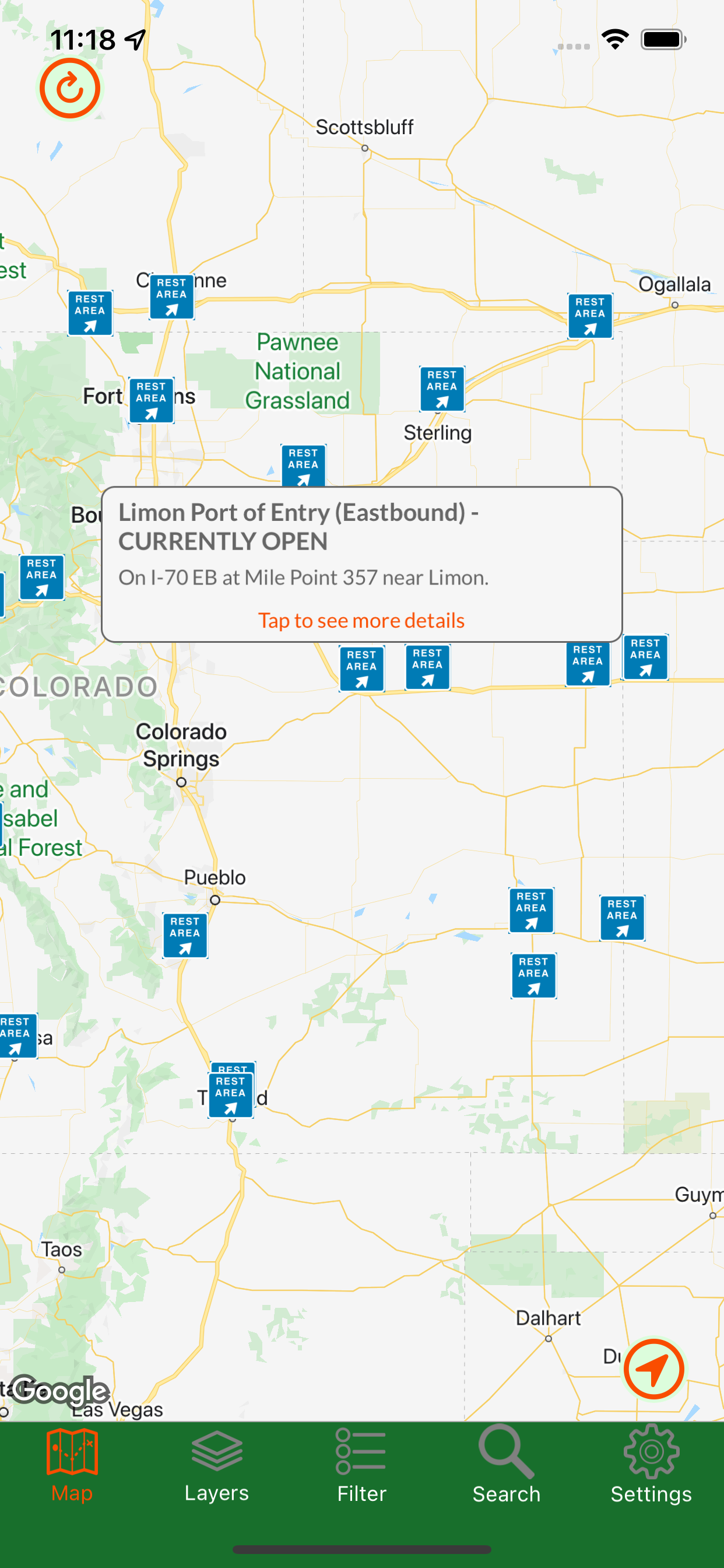
I don’t get it. The color scheme the developers chose is beyond frustrating. Why can’t they use green-yellow-orange-red? The map is interactive with alerts. The color for wet roads is nearly the same color for icy roads. Brown means windy? What if it’s both? This app is total garbage. Take some hints from Wyoming’s road conditions app. Color the road appropriately and use the touch alerts to explain the caution(s)


