So promising, but so annoying
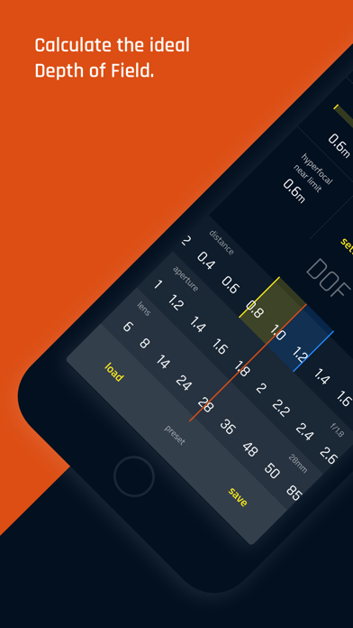
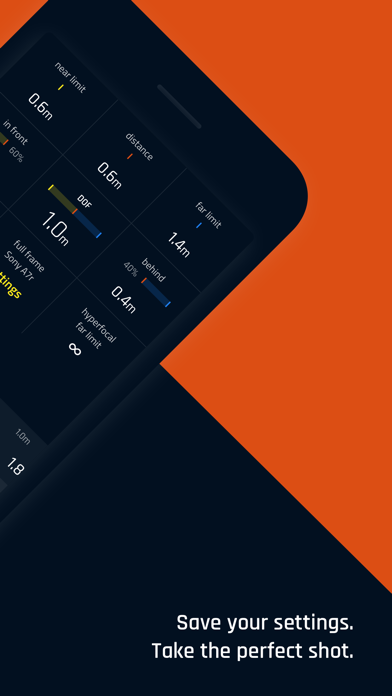
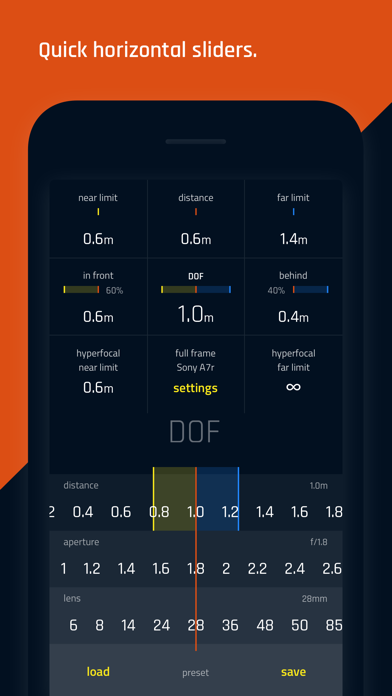
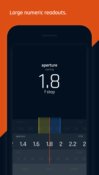
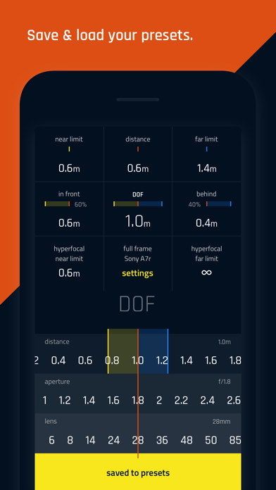
This app looks so promising: I really like the minimalist, elegant, UI. All the other DoF apps that I’ve seen apparently have UI’s designed a decade ago. Just horrible. This is a comparably elegant UI. All that having been said, while the iPhone app seems to work OK, the iPad rendition is seriously flawed: Bottom line, it’s super annoying that this pro version doesn’t support landscape mode on iPad. So, I’m sitting here with my iPad in landscape mode because it’s attached to my keyboard cover. But this app only works in portrait mode, so the screen is rotated 90 degrees. Lol. It’s super annoying that this app expects me to have to disconnect the keyboard cover in order to use it. What’s worse is that the non-pro version of this supports landscape mode, but not this “pro” version. But the non-pro version of this app has a bug where you can’t see the f-stop, distance, and focal length values if your device is in dark mode, rendering it practically useless, if you use dark mode. And if we could fix these issues, it would be really nice if it could show fractions (or decimal points) of inches. When working with shallow depths of field of nearby subjects, showing just to the nearest inch isn’t really enough. I’m trying to figure out the DoF differences in 85mm 1.4 vs 1.8, and to the nearest inch just doesn’t cut it. So, thanks for a nice looking app, but these are fairly fundamental flaws/limitations. It would be great if you could take a look at it.

