Needs some mobile adaptations
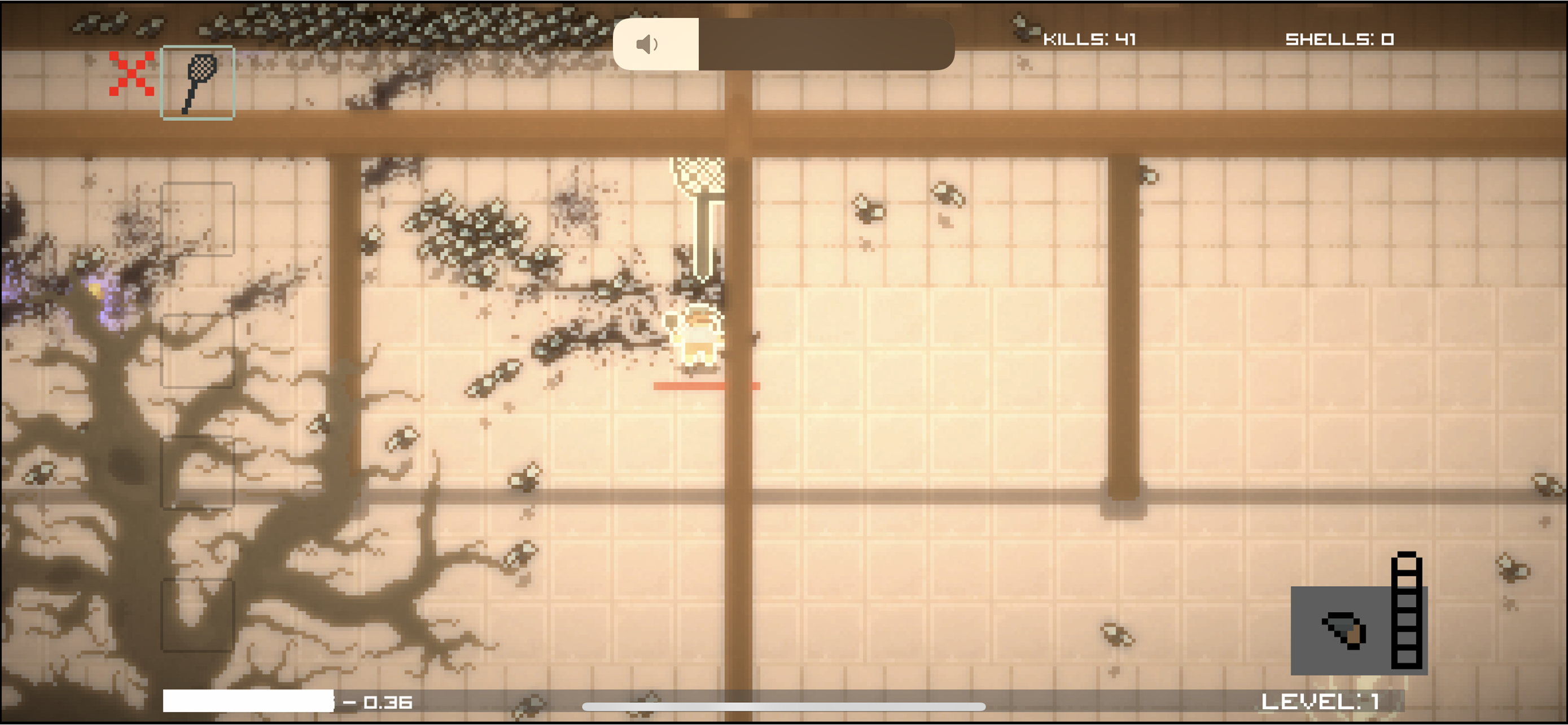
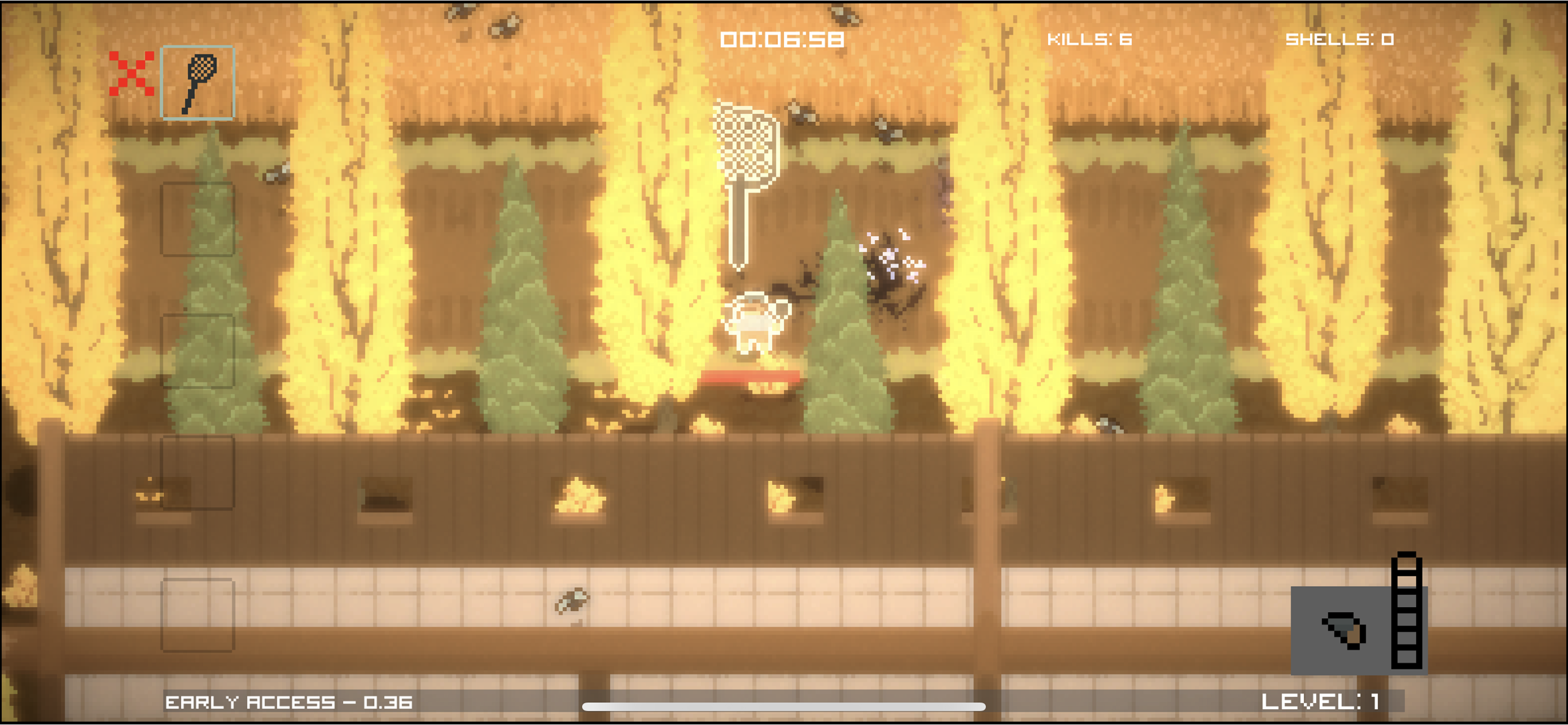
To start off, this game looks amazing. The visuals are extremely well done, and create a very cool vibe. However, some features aren’t very mobile-friendly, and I feel they could be adapted to make the play experience far better. The main menu character select page is a bit clunky, with scrolling not being supported, as well as the character info page that pops out covering the scroll bar when open, making it very difficult to scroll back up and see the above characters. I would change it so you can scroll up and down, and have the cost be in the info pop up instead of showing up under your finger when pressing on it. This feedback goes for the weapon panel, map panel, and settings panel as well. In gameplay, you have to run from the bugs constantly to avoid damage, while your gun shoots in the same direction you move in. This means it is near impossible to hit shots unless you want to walk towards the thing you are trying to shoot. The option for auto aim is available, though I think it should be enabled from the start. Finally, a tutorial would greatly help understanding of the game, though considering it is in early access, I’d guess it’s going to be in the final release. Overall the game is great, fun to play, and really good looking. Just could use some adaptation to mobile and it’d be good to go.


