Good, not great - yet
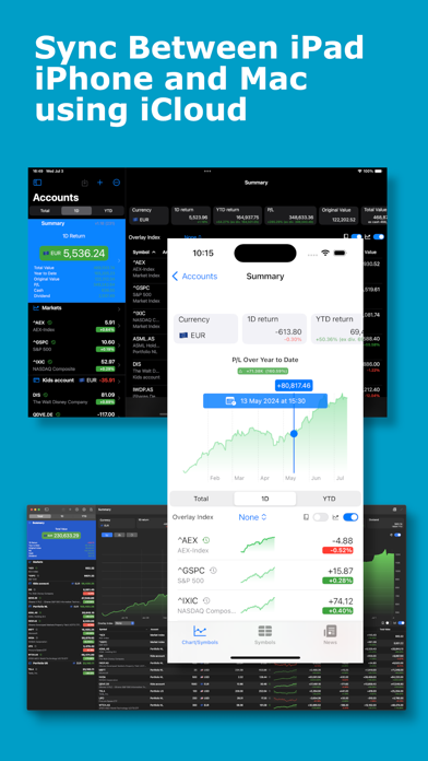
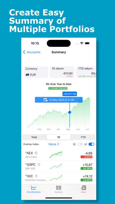
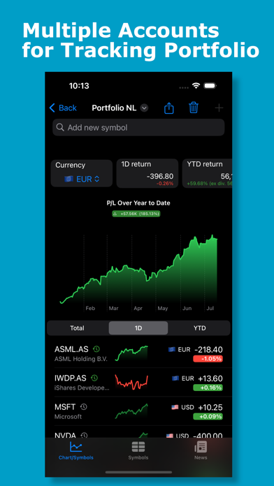
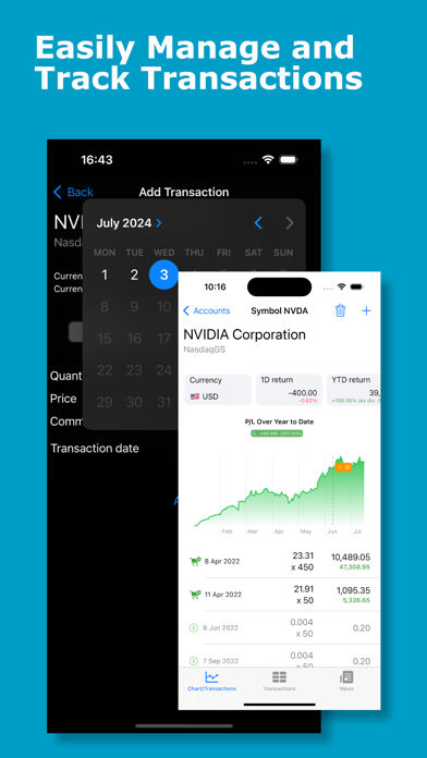
This app does what it advertises. It allows the user to easily create multiple portfolios with multiple stocks, mutual funds, and ETFs (with a fee for unlimited investments) for a singular view of all investments. The app was able to find every stock, mutual fund, and ETF I threw at it. The companion iPhone app downloaded the info from the cloud quickly and has a similar presentation style as the Mac app. Some things I would like to see improved on the Mac app are: - When entering the EXACT all caps name for an investment, it won't find it. Typing in all lowercase finds it immediately and pressing enter selects the first one in the list - nice! - (if more than one investment has a similar name.) - When an investment is selected, it would be good if the app took the user right to the investment overview page and (possibly) even the transaction page. Right now, it is a double-click on the investment, click the plus sign to add a transaction, then select the data entry box for Quantity where tab takes the user to all subsequent data entry boxes. - The cash available for a particular portfolio is not included in the portfolio total, making comparisons with the various brokerage firms difficult, but IS included in the all-portfolio total. Other than that the Mac and iPhone apps look great, update quickly, and provide the user an option for including automatic dividend updates - a nice feature - or excluding them so they can be entered/imported manually.


