UIUX is horrible
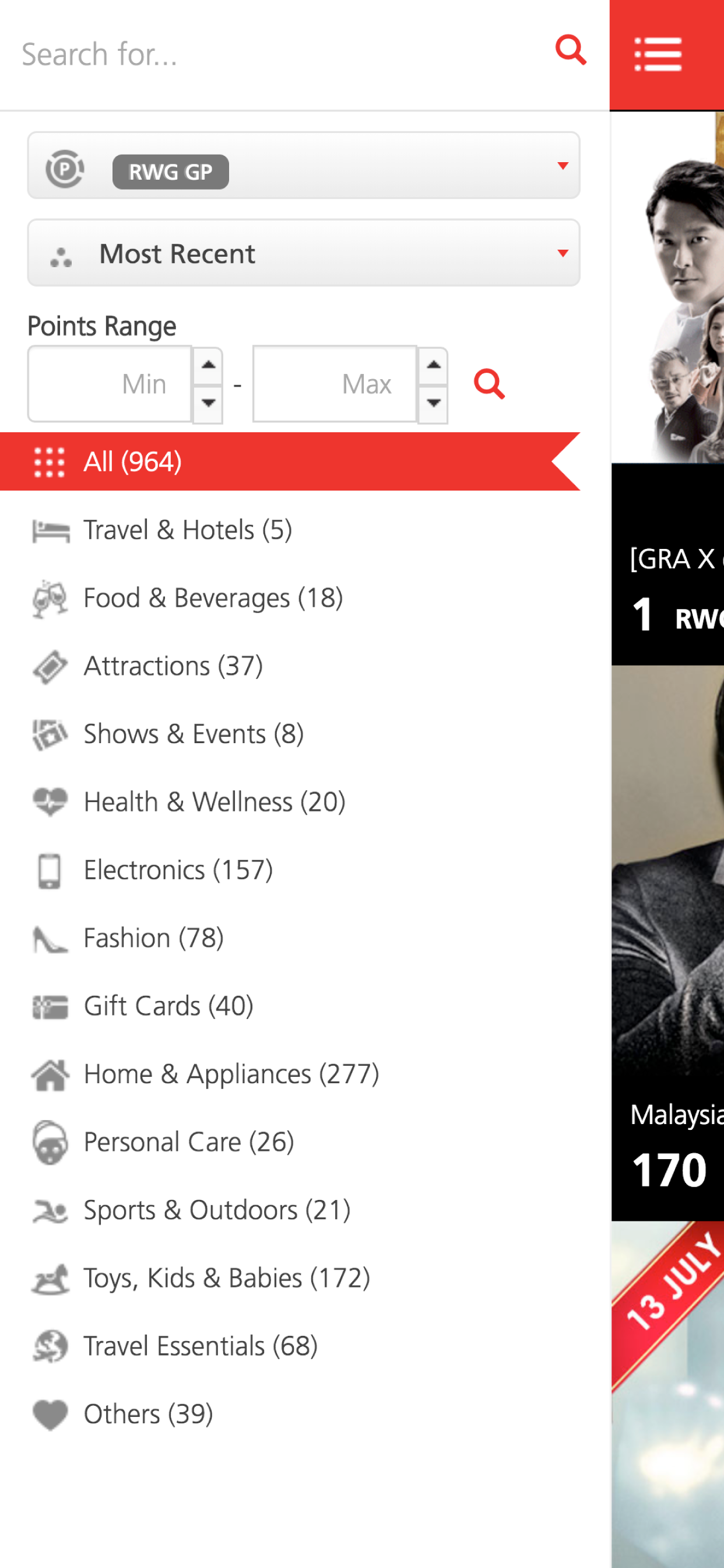
The UI of this app is an absolute disaster. First of all: the top bar is so thin, the search icon overlaps with whatever the original iphone top info UI that shows which app you had redirected from, eg. “chrome”, with the clock only almost a few pixels away above it. On an iphone 12 pro, the Alliance logo is a little bit covered by the top speaker. The top right (cant tell what this is until i click into it) icon overlaps with the iphone battery icon. Second of alI: the bottom navigation menu. WHAT IS THAT?? Its cool and new that i get to scroll it for the other page, but in iphone UX, when u swipe the bottom screen the whole app gets swiped away. Lastly, I download the app, opened it and honestly don't know what i do with it. There is no first time tutorial, no guide. I get a location permission prompt instead lol) TL;DR: dont know what this app is even used for and why cant genting just use back the RWG app if this is just for rewards. Why do they need so many apps? Unless there is a real reason, i don't see the purpose to keep the app


