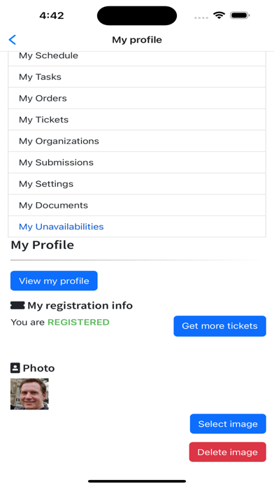
Still hard to read
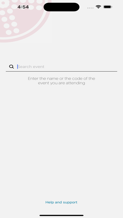
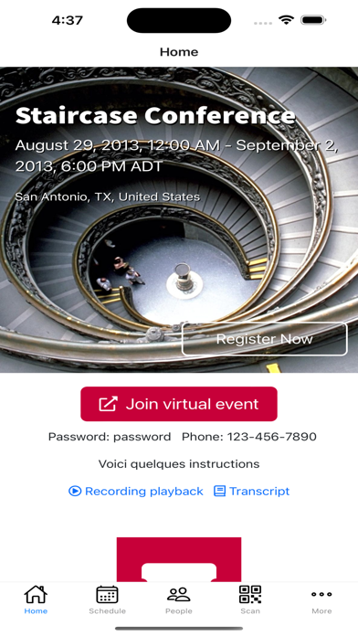
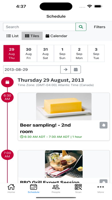
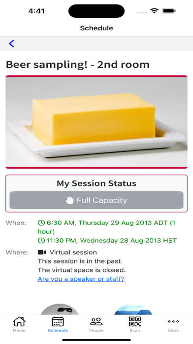
Grenadine just now updated, and the stated reason was to fix some color, but I see that it still uses that tiny, gray font that is almost impossible to read on my iPhone. When heading to a convention event, it would be really nice to be able to tell what room I’m supposed to go to.

