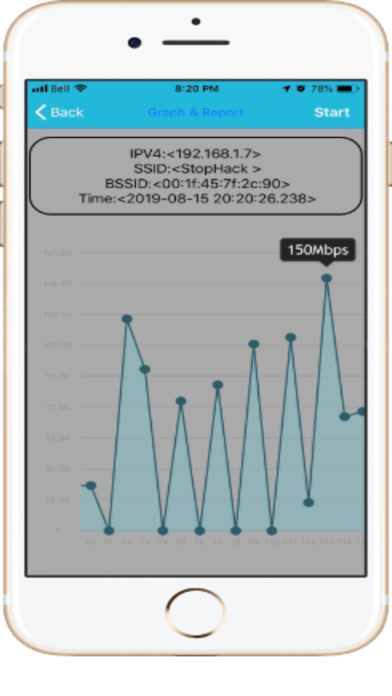
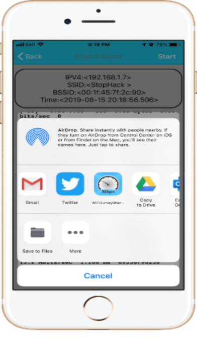
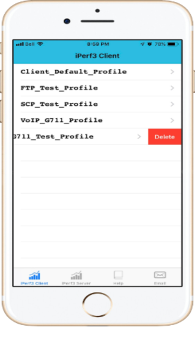
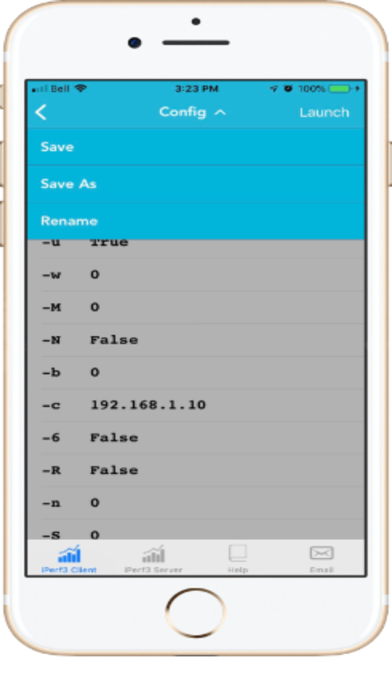
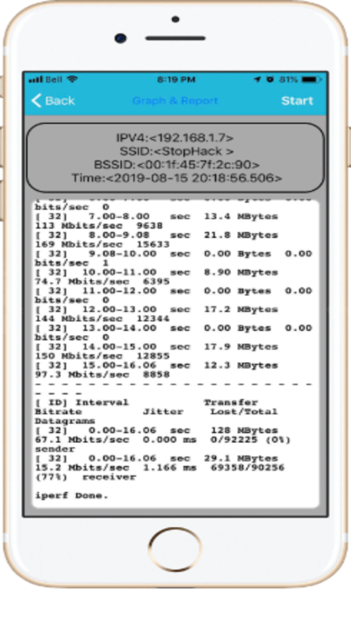
Colours and option setup is horrendous
The light blue line across the top when in the settings has slightly different colour blue writing on it. Nightmare to find what to tap on. Every setting is in a new window. Why? Not necessary, just make the setting available on the setting page. Not easy to use.


