Not much thought went into this app
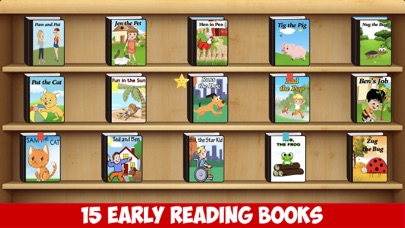
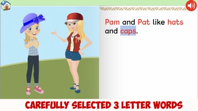
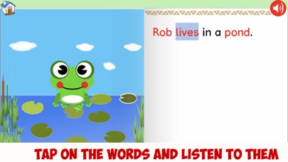
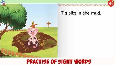
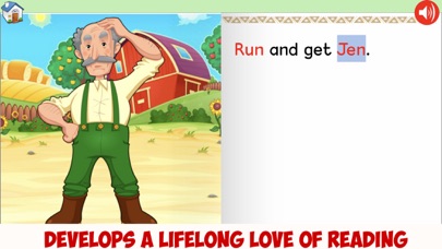
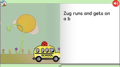
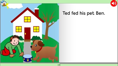
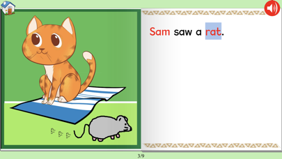
Many Problems: The reading voice is just the built-in iOS computer voice. Not inspiring to have a robotic reader. Bad fonts are used. Serif fonts (with little tails) are hard to read. It uses the Cyrillic lower-case 'a', like you see here, which features a curved line over the top of the 'a'. For children, it would have been better to use a Greek-style 'a', which looks like a circle with a straight line down the right side, much like children's handwriting would be. This is supposed to be a first app to learn reading. Rather than use simple words that follow the rules, like cat, mat, dog, log, this app is full of harder words such as saw, away, goes, sees, star, lives, good. The stories are unimaginative. Things like "he saw the tin" do nothing to inspire. I could think of stories that would captivate children, while still only using simple words. It seems like an app that one person made in their bedroom. The price is too high for the small amount of work that went into it.

