Almost perfect
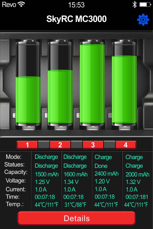
The first page data sreen is too large for iPhone 13 Pro, the last two row is covered, can not be read. The graph line on Details page is dark blue on black background, therefore not an easy to see, white or yellow would be much more readable.


