Could be more efficient
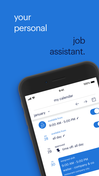
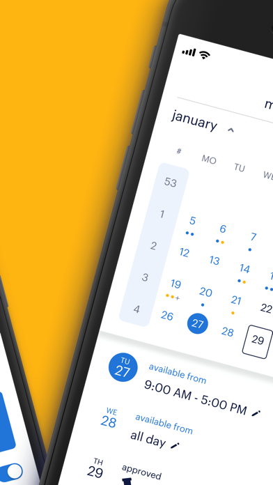
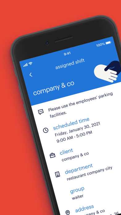
The app is pretty self explanatory and very simple, however I do wish that the locations were displayed in both the main screen of the calendar as well as when you click on the assignment as apposed to having to scroll all the way to the bottom to see where my location is that day. “Punch Clock Shift” section when you do click on the assignments seem a little unnecessary to be on top- I think the location of job for the day should also be displayed in the same area where “Scheduled Time” is- it would make it so much easier for everyone! x

