Usability not great. Still prefer the original PowerOne SE
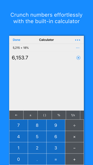
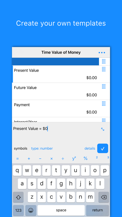
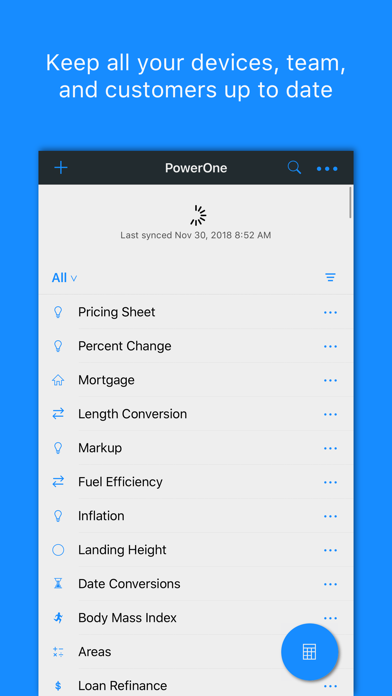
The developers have worked to make this newer version great, but after giving it a fair trial, I have switched to other more usable options and relegated this one to being a back up option for a few specific uses which aren’t covered well by other iPhone/iPad scientific calculators. The original version was much better for general scientific calculator use. The range of functions and templates is excellent, but it is clunky and awkward to use. It doesn’t make good use of the screen real estate in the iPad version at all, simply expanding the iPhone format to a larger screen. You can still enter multiple memory items plus reuse or edit equations from your history but this could be done so much better: the ‘Tydlig’ calculator is a good example of how this function could work in an intuitive way. Downsides: 1) using templates is an awkward workaround for simple things like entering a unit conversion or constant during a calculation. On an iPad I would have preferred to be able to convert a unit on one side of the screen (or use a templated calculation), and then simply drag the answer (or press a button) to add it to the calculator screen). As it is currently, there is an awkward need to jump between screens and relocate the template answer to use the value. The buttons are quite large so both display screens could be shown side by side whilst still remaining usable if the buttons were smaller. 2) the subscription option and online sync functions don’t add any obvious benefit for my usage compared to the older version (PowerOne SE). In fact the usability of the older version is still better (can see and enter memory and historic equations from a sidebar which is displayed continuously). The new version makes you jump back and forth between these screens and then enters them as something like ‘mem0’ instead of showing the actual value. I think if you need to use and share lots of templates then the subscription model makes more sense. Overall it’s capable but I would really like to see these usability issues fixed so I wouldn’t need to alternate between different calculators for common functions

