New app update review March 2023
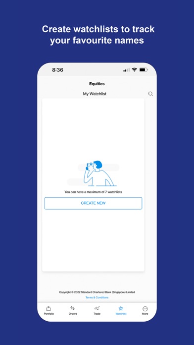
Hi Sc Team The new app interface is clean and nice looking but it is not a user centric design especially when it comes to getting a sense of the numbers 1. It does not give a invested amount number which will make it difficult to calculate the investment gains as a summary topline 2. The individual investment also has the same issue the current price of the stock/fund is there but the average purchase price is only visible when we select the drop down 3 Earlier we could see the last 10-20 purchase details - lot size, price of each lot , date of purchase etc in one go. Now we need to click and do a drop-down to view each transaction which is tedious if you want to do a quick check on your last 5 purchase prices 4. Earlier App version had the summary of average purchase and current price in the buying currency (usd in case of USA stocks) not again you will not get a sense of the USD value unless you do a drop down. 5. Summary of investments in the buying currency also not quickly available at a glance All of the above impacts the consumer buy- sell dynamics and in this case adversely. I would request that you reconsider the app features and add stuff which enhances the utility and focuses on getting key information quickly at a glance rather than a glossed up version which looks sexy but has limited utility value for the core purpose of investing/trading


