Needs a complete rework
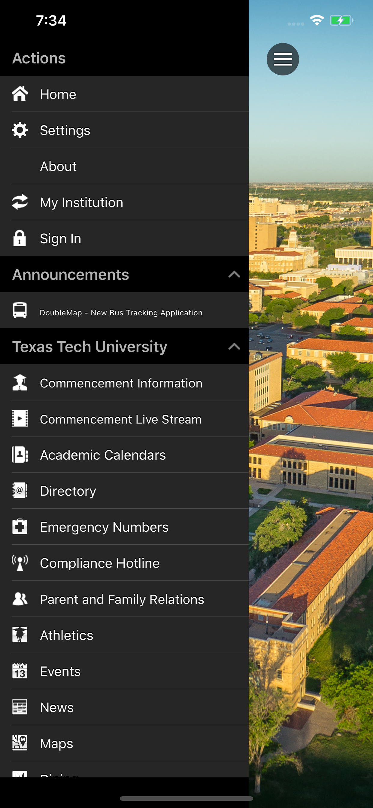
I love the idea of an app where you can see a bunch of information about you with your university. This app tries this, but honestly it’s terrible. It constantly signs you out, it can be unintuitive and frustrating to use, and it’s a glorified web browser with most features. The only thing I could say you should use this app for is seeing your schedule, and even then you’re better off just typing your schedule into calendar or notes. Not to mention just how split up everything is for Tech with the app. I mean seriously why have an entirely separate app for the dining bucks. At the very least let me add my student ID to the Apple wallet so I can have that option in case I forget my ID in my room. Do better Tech. This app is subpar at best.


