Ruined your own app!
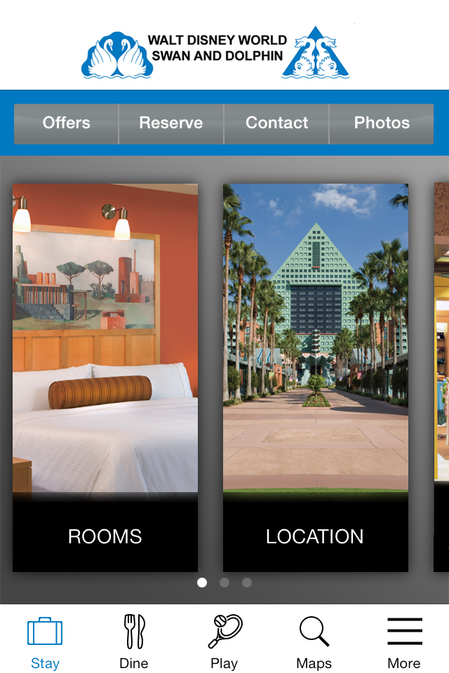
The new update is horrendous! Did anyone actually try this garbage out from the user end, before updating? The old version was basic but effective. It was easy to use. Easy to see. Information easy to find. New version color scheme makes text difficult to see. Layout is confusing and makes information hard to find. Worst app update I’ve ever seen! Not hyperbole.


