Some UIX needs improvements
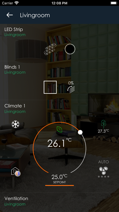
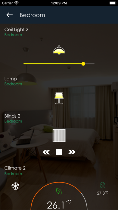
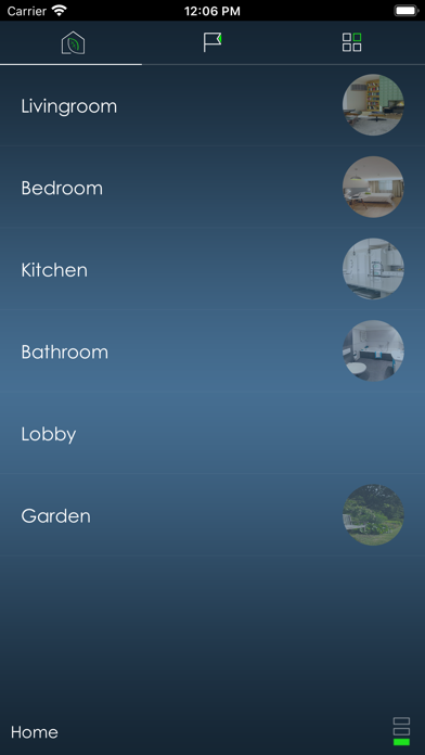
The app is good, but on a first testing here are my impressions. In the lite version on the demo page there are some things that need to be reviewed: - the three buttons on top need also text explaining what they are, some are intuitive but not all, for a common user they are not intuitive - the info from the sensors would be nice to be displayed all of them on top, and not scroll down in order to see all of them. Is a much nicer feeling when you have the info on a glance - before creating a new project exiting any room would take me to the devices page and not back to area page - in the favorites area the button that controls the temperature in climate1 is hard to be handled, it could be bigger - on blinds1 the animation of the blinds only shows when you press on the stop button - on climate1, the overlay from the 4 corner buttons is too faint, the feeling of mixture appears when the overlay is present - also here the info from the sensors will look better if positioned on top, to have a glance view like in the ventilation section - in the device area, i could not figure out what does the small green dot represent - blinds2 animation works like it should, same should be applied also on blinds1 - getting out of one device brings me back to the favorites area and not back to the device list - how about some info regarding the evolution of energy consumption, higher now than in the last hour, less...also some graphs with history would be nice I hope all the above will make the app much better.


