Why do you need to press save when you change notification levels?
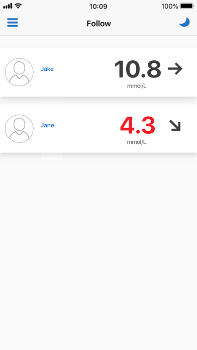
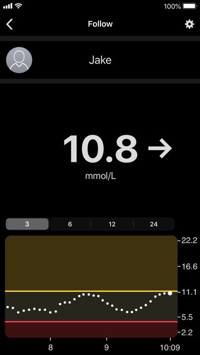
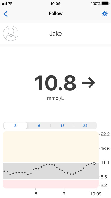
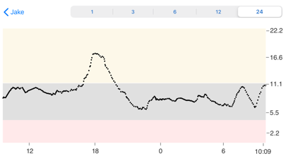
In Dexcom Share when you change notification levels you dont need to press a save button but in Dexcom Follow you have to. Therefore it is easy as a user to forget to press save and miss notifications I think you should change so that they work the same and choose that you font need to save which feels very Word 95 (i.e old fashioned UX) The basic user experience in the apps is different which is suprising as a user. I understand it is probably different teams developing but how hard can it be to decide common UX principles to makenit easy for the users


