PLEASE - Redesign UI for this app
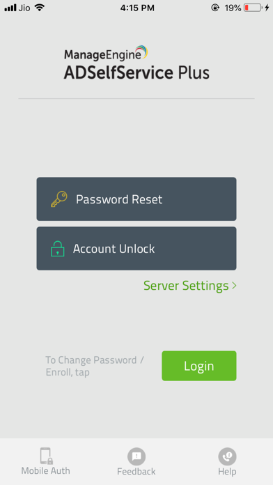
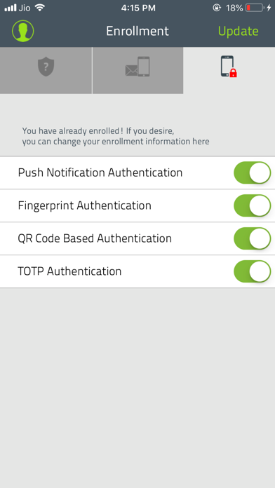
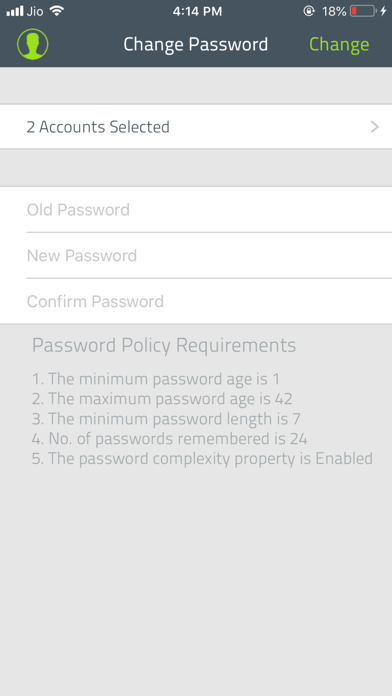
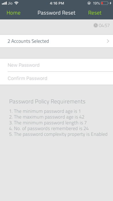
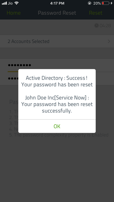
I am writing to provide some feedback about the ADSelfService app for iPhone. The UI of the iPhone’s needs some work, particularly on the main screen after users successfully log in. The main screen is very misleading for several reasons. First, the option to Enroll in other MFA recovery methods is hidden. Second, the main screen shows users the option to change their password which causes some confusion for users. Since the the other options are hidden, they tend to change their password accidentally even though they don’t have to. Third, the Google Authenticator interface should show a QR code as first option. The secret key method should only be used if scanning QR code is not available or give this as advance option. Finally, users should get some type of notice indicating that Admin requires Enrollment of at least X number of methods. Overall app works great, but the UI has been misleading for quite some time. I hope this feedback makes it to the app developers. Thx


