Useful but room for improvement
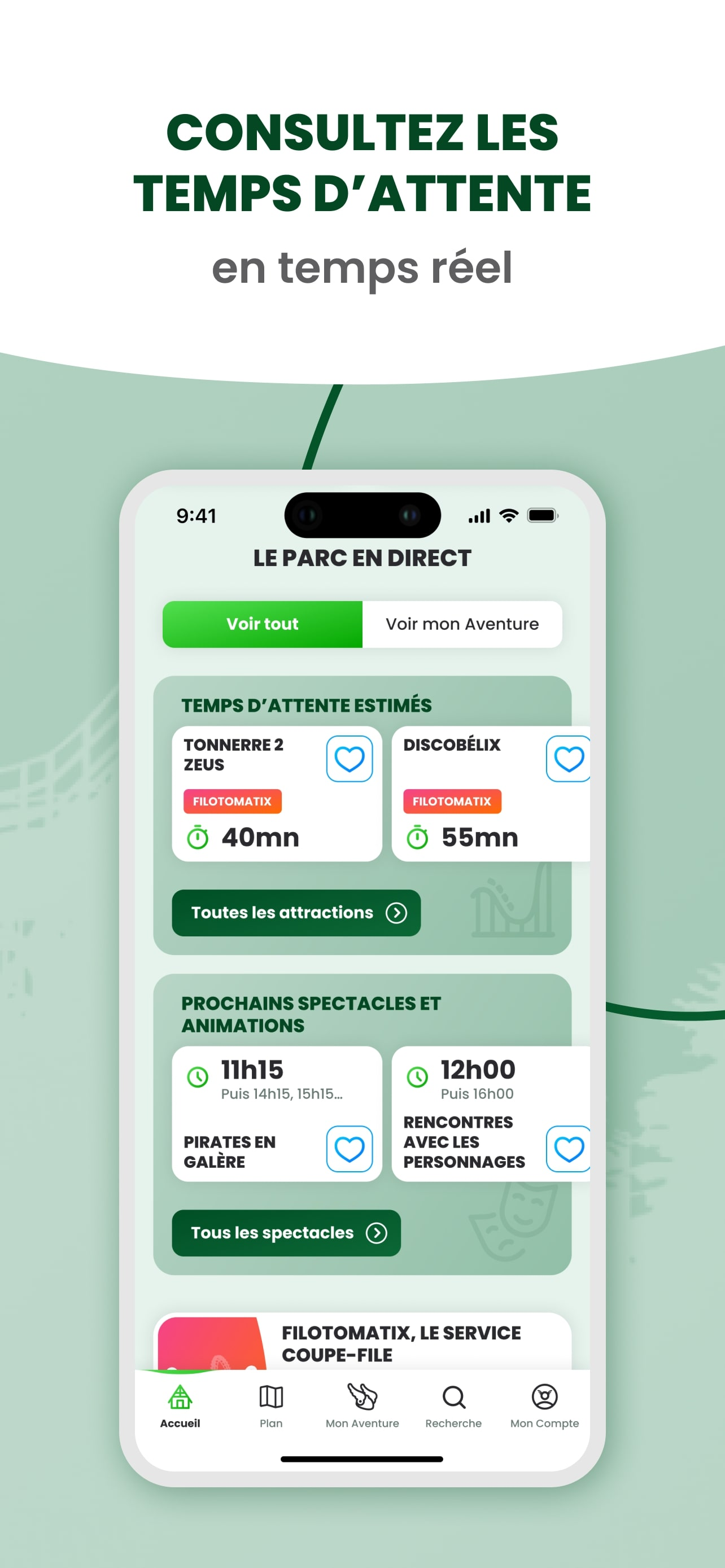
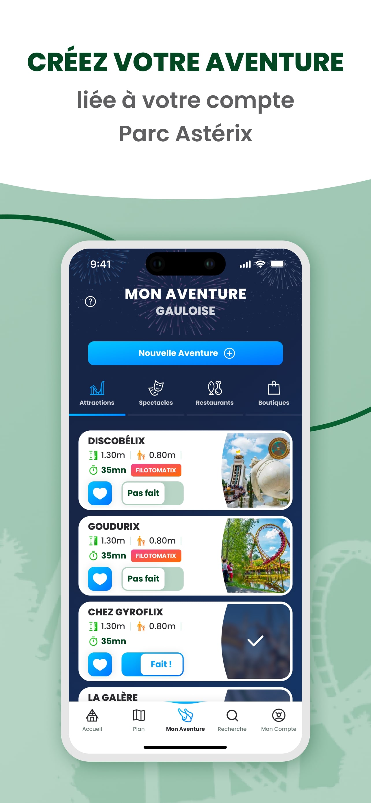
The app was quite useful during our visit but there is still room for improvement. We booked Filotomatix Bronze and everything worked out well. However, it is not very well integrated. It would be nice if I could see the attraction I booked right on the map and book attractions or the attraction page. The Filotomatix page is like it’s own website only accessible through a button on the landing page. The map is not very intuitive, because the attraction markers are quite big and block the view. They also glitch a lot meaning they are cut off or some markers are missing sometimes. Regarding languages: The languages in my phone are German and English in that order. If my phone is set to German, the whole app is in French, which means the app doesn‘t use proper localization. In that case it would select English as the preferred language if the apps options are French and English. You have to set your phone to English to have the app in English. But still, many pages, especially everything Filitomatix related, are still in French which can get annoying. But as I said in the beginning, the app is still a useful tool and the park is awesome. Just some suggestions on where improvements may be needed.


