What’s the point?
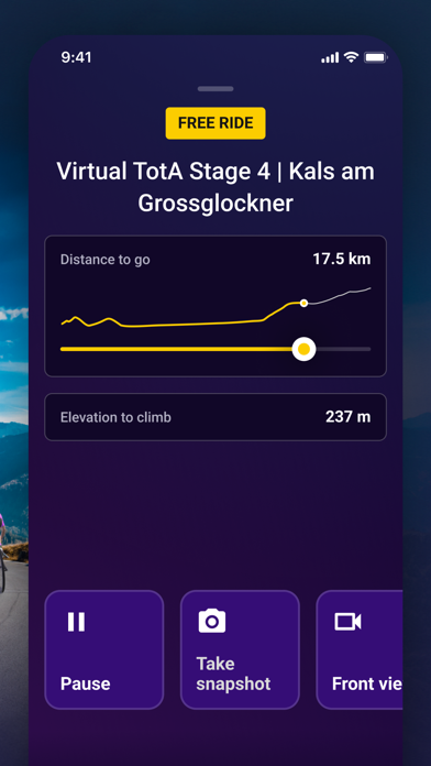
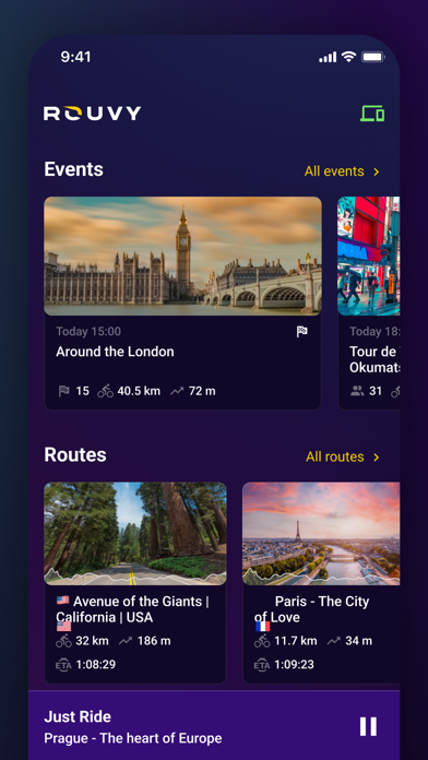
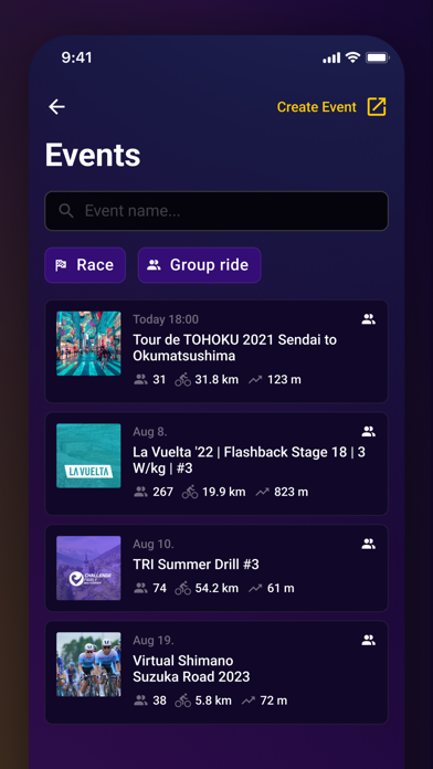
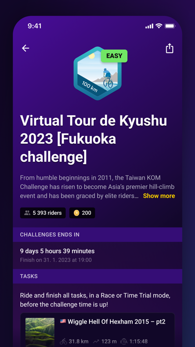
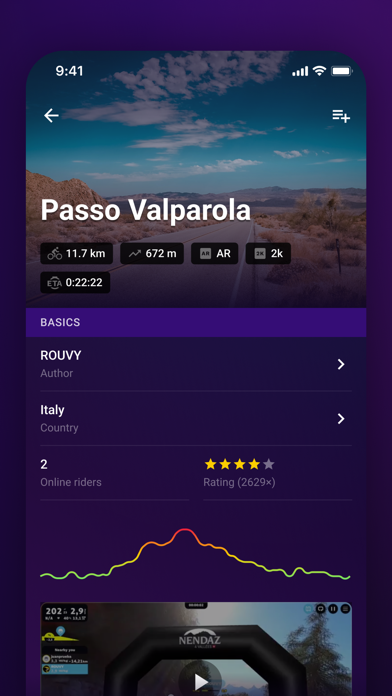
Aside from providing extremely rudimentary and basic controls during the ride (I wish you could change the scale of the UI, customize UI on main screen etc.), this app makes zero sense and is completely useless. There’s no way to see my history, no way to plan my next ride, no way to see the Challenges or Workout plans I’m a part of. I can’t even find my workout plan by seatching its exact name. News? What news? It’s a blank tab for me. Ride later? Same story, blank tab. There’s a giant yellow sticky button that serves no purpose too. Can’t you find a more user friendly way to collect feedback other than this obnoxious ugly yellow circle in the corner? It looks cheap and makes your alp look cheap and bloated. Rouvy, you need to really push hard to compete with Zwift and this ain’t it. What a waste of an app and opportunity.

