Bad UX, but Game is Good Once You Know
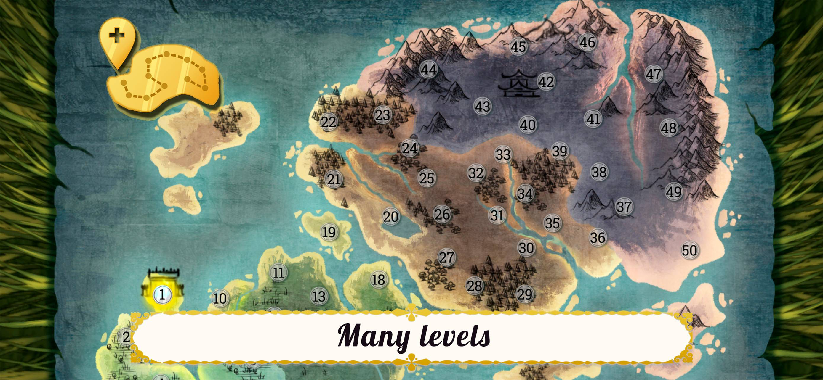
I'd give it 3 stars because Level 3 was impossible without the meta buildings upgrades, which was introduced too late and was impossible to find. Without the upgrades, Level 3 and beyond literally could NOT be completed with ANY stars. I had to dig and dig online to find an answer. Finally I discovered upgrading meta buildings. The game itself doesn't tell you about the buildings until well AFTER level 3!! Even then, it's in such a bizarre place: buried under the gear, and called "meta buildings"!! No normal gameplayer would think that means upgrades. Also, a gear is a universal icon for settings. Burying upgrades there that are necessary to enjoy -- let alone complete -- the game makes no sense. It's all a terrible UX choice that I believe will cost the game good reviews. There's even a review in the Apple App store that doesn't say this directly, but the author is so frustrated with certain elements of gameplay that point directly to them not having upgraded anything. I assume they probably missed the directions on how to upgrade meta buildings. Or they were stuck on a level before it was even introduced. Given that it's nearly impossible to discover how to do it on one's own if you missed the direction, I will again reiterate that it came faaaar too late into gameplay. Extremely frustrating.


