Interface looks good, but slow and hard to use
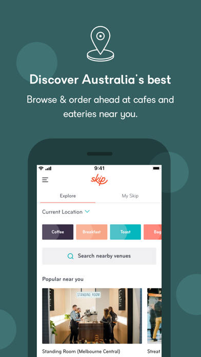
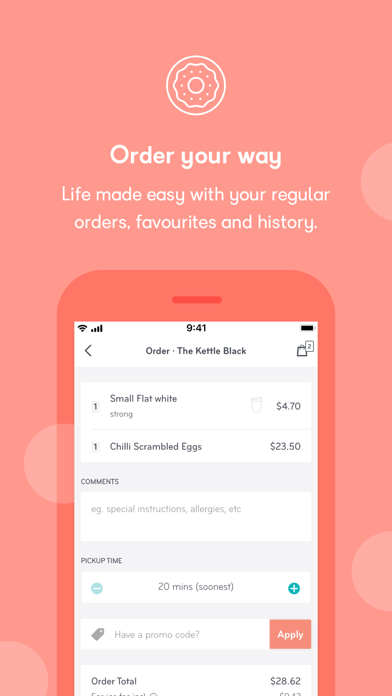
This is a new app on the block so I will be gentle. As with many apps lately, the signup button is not clearly marked. Yes it has the words "sign up", but it's the same color as the background so it blends in. New people should be drawn to the sign up button. Existing users should already be logged. Users that got logged out know they have to log in so they will actively look for the login button. New users should flow easily into the funnel. When I tap for food and then pick a venue, I am shown coffee. Maybe the venue doesn't offer food, but this is confusing. Then it appears there is no way to go back because the art assets for the button (and other buttons) didn't load. If there is no back button I have to go through the whole process of putting a coffee item in my order before I can go back and remove it. But then there is no remove button! My plea to the marketing team, UX, and project management is this: please prioritise usability over fancy graphics and animations. They add to the app when everything else works smoothly. But when it doesn't, the fancy stuff looks amateur. A custom spinner doesn't make my coffee come out any faster.