Worse than worst
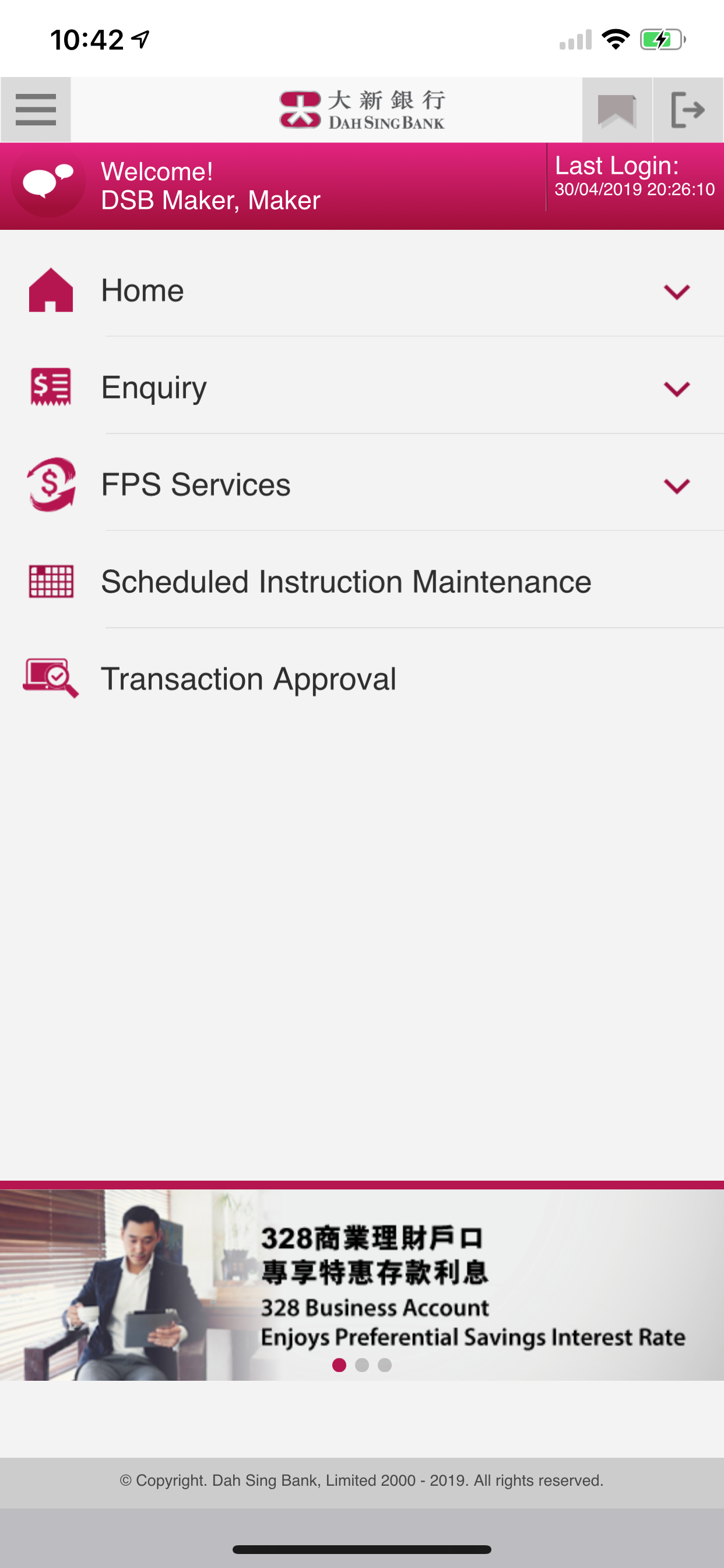
The UX/UI make it very difficult to find what you want. Eg e-statements. They should provide a consolidated statement. And easy to retrieve current. Saving. USD individually. You cannot trace the transaction up to the balance. Etc… etc…. Why it is difficult for them to make a reasonable one. Just copy the storyboard with different wording. Fonts and theme. Then it is a much better one already. … The digital officer is dumber than dumb.


