Great app but has a confusing information architecture in mobile
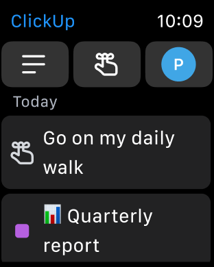
I have used this app for many years and I used to love it. Recently, not so much. Despite I find some of the new features valuable, the UX in mobile is not great, the navigation is soooo confusing: 1) I cannot access to “Agenda/Calendar” view in Home in the same way as it works in desktop. (And for me this is one of the main features I used). 2) In “My work” tab, the tasks and events are not shown in a chronological order (as they do in the “Agenda/Calendar” feature in desktop). First all the task are shown and then all the calendar events, without taking into account which one goes first according to the time scheduled. I cannot organice my day with a calendar like this, I need to see all the events (tasks or calendar events) organized. The information architecture definitely needs to improve as there are some repetitive elements, there are a lot of different menus… It would be great to have an app in mobile that makes the navigation easier and in which the experience feels very similar to desktop. I use it a lot more in mobile, so its very annoying that the UX in mobile is not good


