Needs a lot of improvement
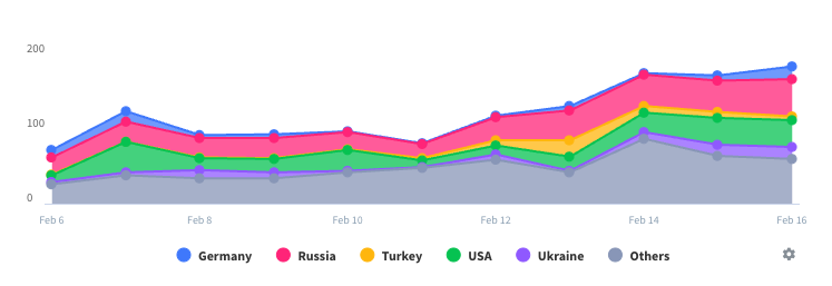
How does this app manage to forget my login data with every update? It’s tiring. And did any of your investment professional ever review how the fund performance is displayed? Without an axis break (like every normal financial chart) you can only see tiny zig-zags. And please stop using pie charts everywhere. It’s even academically proven that pie charts are the least intuitive of all types of charts. By far the most uncomfortable and least intuitive banking app that I have. Please benchmark others.


