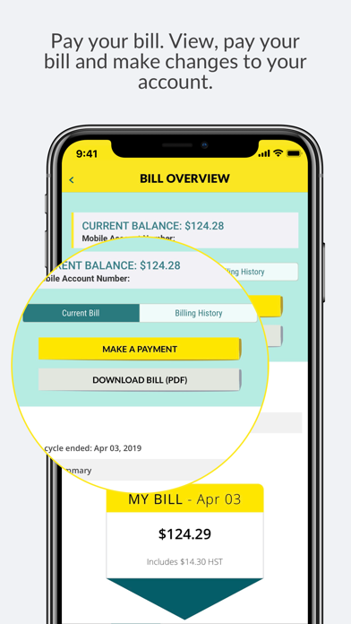
Payment screen
Hi again Please change the layout from querty keyboard to an easier layout when making a payment. It would me so much better and easier. I kept making mistakes when entering credit card number and expiry date too . So please fix it on the next Fido APP update . Have been waiting for this update for months and years. What is the hold up? Listen for once , seems you don’t care and to make things easier instead of worse.


