Great app, but the new interface is user-unfriendly
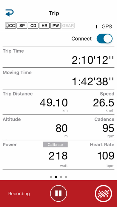
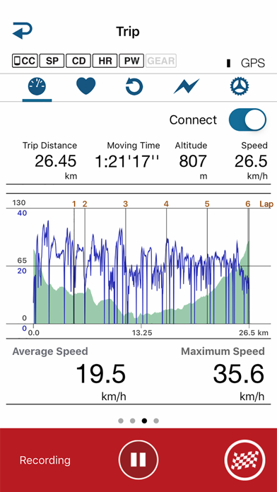
On one side, this is the best cycling app in terms of connecting peripheral equipment and sensors. And it is FREE! On the other side, the new interface is a huge disappointment for me… Firstly, the labels and fonts - labels are capitalised, grey colour and small font size -VERY difficult to read them when cycling, especially if it is a sunny day. Data fields are in huge fonts, placed very close to each other - it is difficult to tell one from another at a quick glance while cycling. Take a look at Runkeeper app - nice round bold fonts, all field titles are in caps - no small letters, clean and clear, all fields are separated one from another, one quick glance is enough to see what you want. I have a feeling that the app was tested in a comfortable chair and good lightning, not on the bike, where there are many other factors. Icons are strange (colours and etc.) and are placed close to each other and other controls - very difficult to press what is needed on the go. Please note that iphone adds it’s own < Search field in the upper left corner, just where the app icon for return is located… The app screens - they are swiped until you get to the map - from there it is not clear how to swipe back - somewhere in the upper part of the screen, but not at the top? It’s a quest every time… Why not at the bottom of the screen or somewhere on the scrollbar (which does not work on that screen)? Looking forward for the app to gain user-friendly interface :)


