Poor design
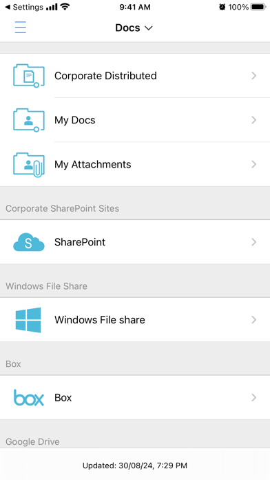
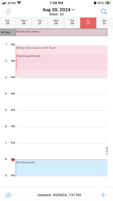
The latest release with all sidebar icons almost looking exactly the same is terrible. Not sure who approved that change but they obviously don’t use it. Looking at 5 icons of the same colour minor differences is useless. Then the main page of icons is an absolute joke. User design was not consulted. Hopefully they send out an update soon.


