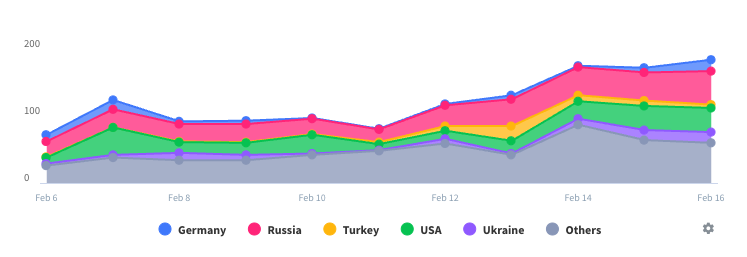
Poor display, bad interface and anomalous data
I tend to use the on-line application rather than the app. The graphical display on the app uses very indistinct colours compared to those in the on line version. Certain links appear not to work (eg feedback screen does not offer the ability to send feedback but merely covers FAQs. The chatbot button on the feedback page does not work. The menu item about viewing the running information of the plant (which I tried to access to see if I could change the colours on the graph display) goes to a “not found” message. However even the on-line version shows inconsistent data such as: Reducing total grid consumption as the day progresses Anomalous readings showing the battery feeding the grid PV consumption showing in totals but not showing on the graph (and I don’t have PV directly connected to the inverter as my system combines hydro-generation and solar via the grid connection).


