Mindblowingly Atrocious
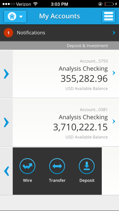
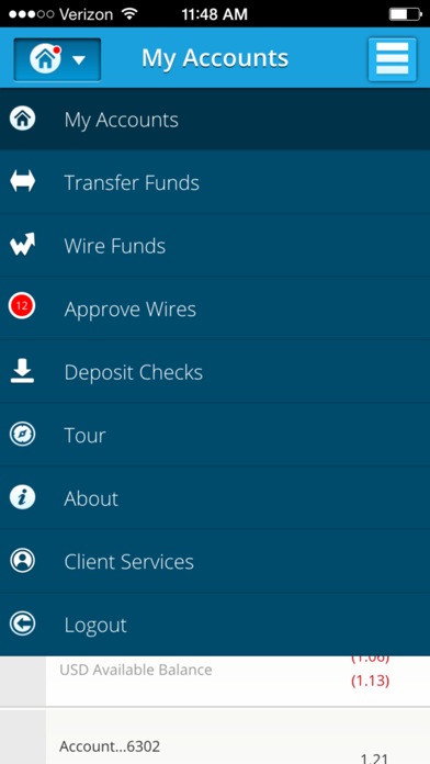
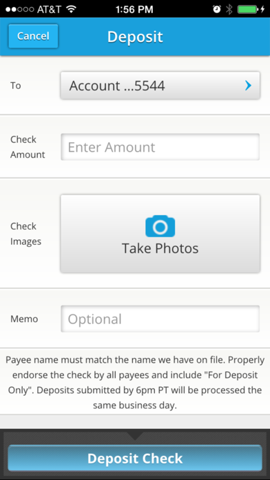
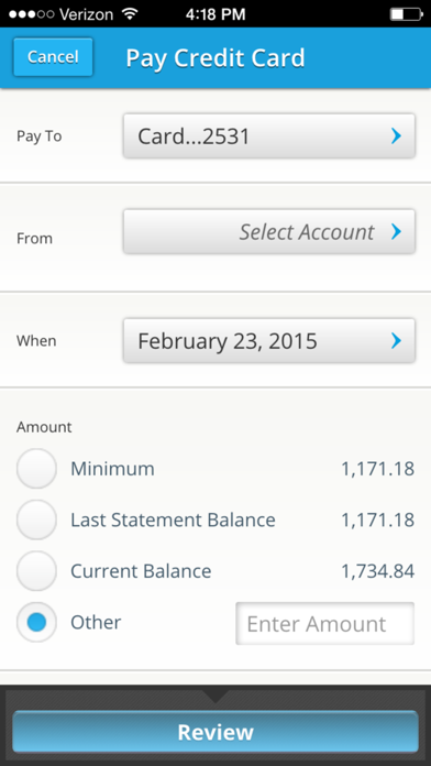
I think this app has to win some sort of award on how terrible the UI/UX is. Really. For a bank that targets technology companies and founders, this app definitely has not considered at all what their user requirements are. What makes it even more embarrassing for “Silicon Valley” Bank, is just how cheap it is today to build beautiful and well functioning apps — really, dirt cheap. You just need to have the will.


