App has randomly switched to German
Have this app for work. Recently it just switched to German instead of English. I can’t see anything in the setting to change this back. Actual functionality when it’s working is fine so would be 3star. mid app

Yes, Cashback do Pai is completely free and it doesn't have any in-app purchases or subscriptions.
🤔 The Cashback do Pai app's quality is mixed. Some users are satisfied, while others report issues. Consider reading individual reviews for more context.
Cashback do Pai is free.
To get estimated revenue of Cashback do Pai app and other AppStore insights you can sign up to AppTail Mobile Analytics Platform.

4.79 out of 5
3,790 ratings in New Zealand
Have this app for work. Recently it just switched to German instead of English. I can’t see anything in the setting to change this back. Actual functionality when it’s working is fine so would be 3star. mid app
I’m trying to login to the corporate VPN. I’m not an app reviewer. Don’t ask me to rate your app. I’m certainly not going to like and subscribe. It’s not like my rating means anything: we get this pushed to our phones automatically. 1 star
This is cool … and makes me feel safe.
Used for a WHOLE 2mins - fantastic! Recommend to everyone - even if you’re not in payroll!
Highly appreciated
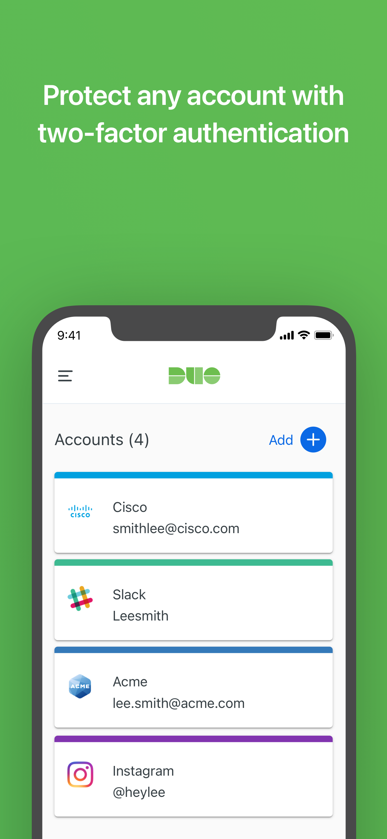
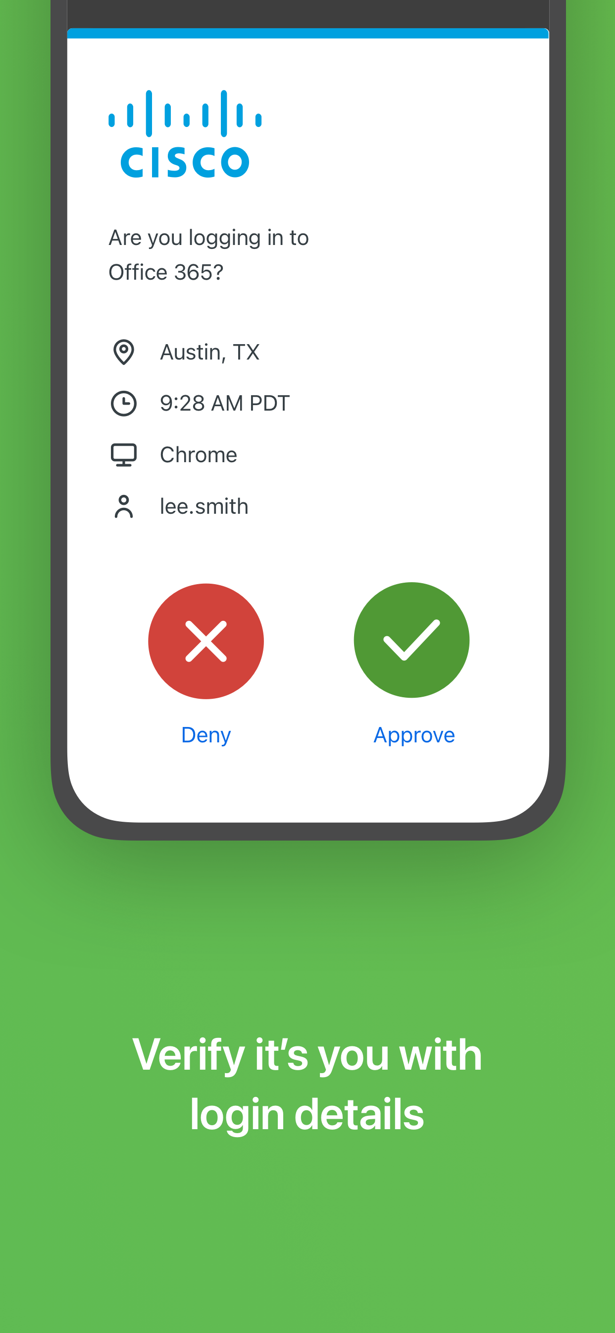
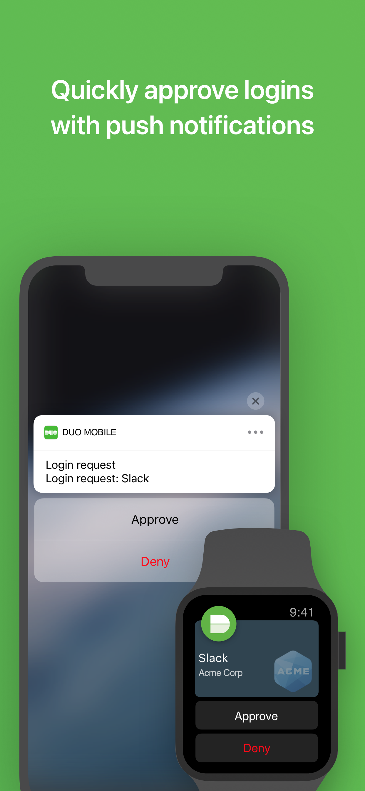
Fantastic being able to approve via tapping accept on my watch!
Doesn’t actually transfer accounts via keychain as claimed. Have to reset all my 2FA after moving to a new device. Duo is the only app to have this issue. Trash, don’t trust it.
Extremely inconvenient and unnecessary!
When it works it’s fine but it locks you out frequently and no response from “support”. Eventually the gates open for no apparent reason. Probably not the best security software.
The new update is regressive. The card design is serious usability regression. Wasted space, having to scroll to find entries, EXTRA clicks to get to the actual codes. It’s a time waster. Please revert or give a compact view that is usable.
|
Chart
|
Category
|
Rank
|
|---|---|---|
|
Top Free
|

|
16
|
|
Top Free
|

|
18
|
|
Top Free
|

|
19
|
|
Top Free
|

|
24
|
|
Top Free
|

|
27
|
